Search this site/
Projects — 05 / 05

Mac SOS

Home Apple support in Geneva since 1996. A site that does not introduce itself: it answers, one problem at a time.

Period2026PlaceGeneva
RoleThe whole chainLivemac-sos.ch
CraftsIdentity · Print · Interface · Development · Digital marketing
DeliveredThe website updates and the art direction

Mac SOS repairs Macs, iPhones and iPads in Geneva: at the client’s home or remotely. The business has existed since 1996: so the site did not have to introduce itself, it had to answer. Each problem has its page, and each page says what is happening, what can be done, and where it starts.

The project, in pictures ↓
Designed · 01

Art direction

One yellow, one black, and the morse of SOS. A repair brand has to read in a hurry, not be contemplated.
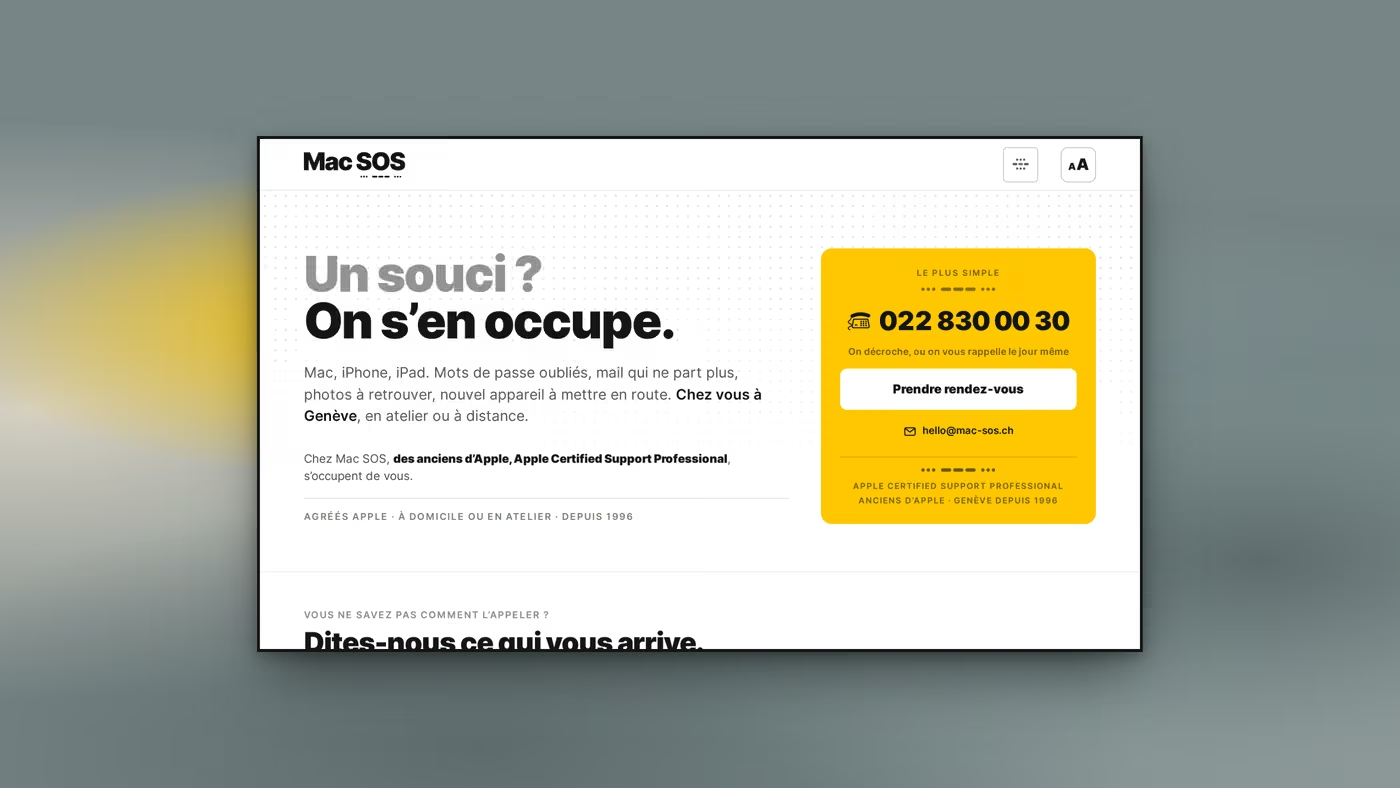
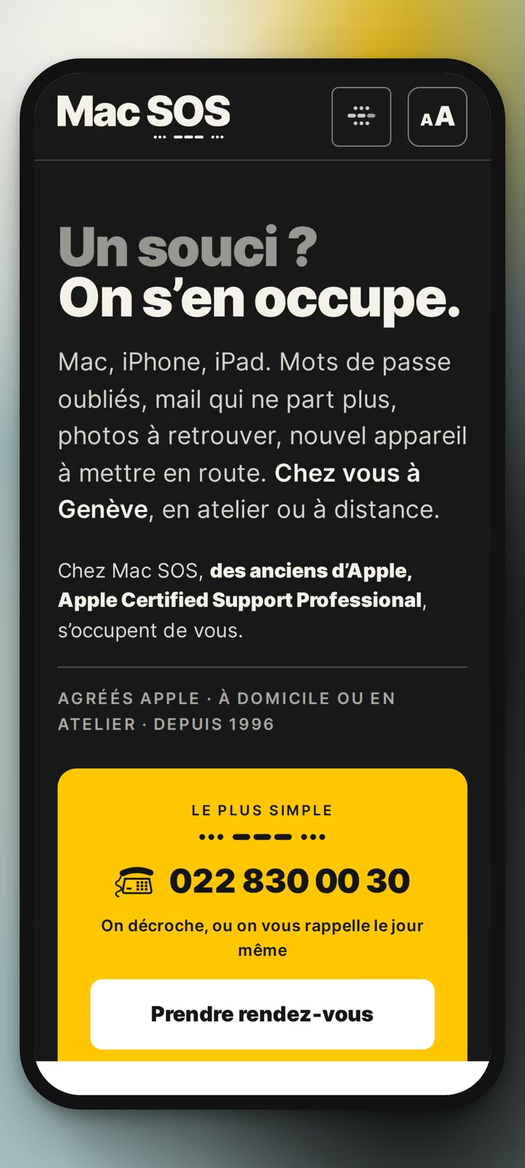
VisualThe opening. The heading asks the visitor’s question before naming the trade: “Un souci?” in grey, “On s’en occupe.” in black. On the right, the yellow block offers one thing only: the phone number, large, with the callback promise under it.
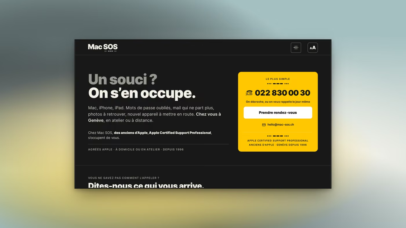
VisualThe same screen in dark mode. The yellow does not shift: it is the colour that carries the action, and an action that fades at night stops being one.
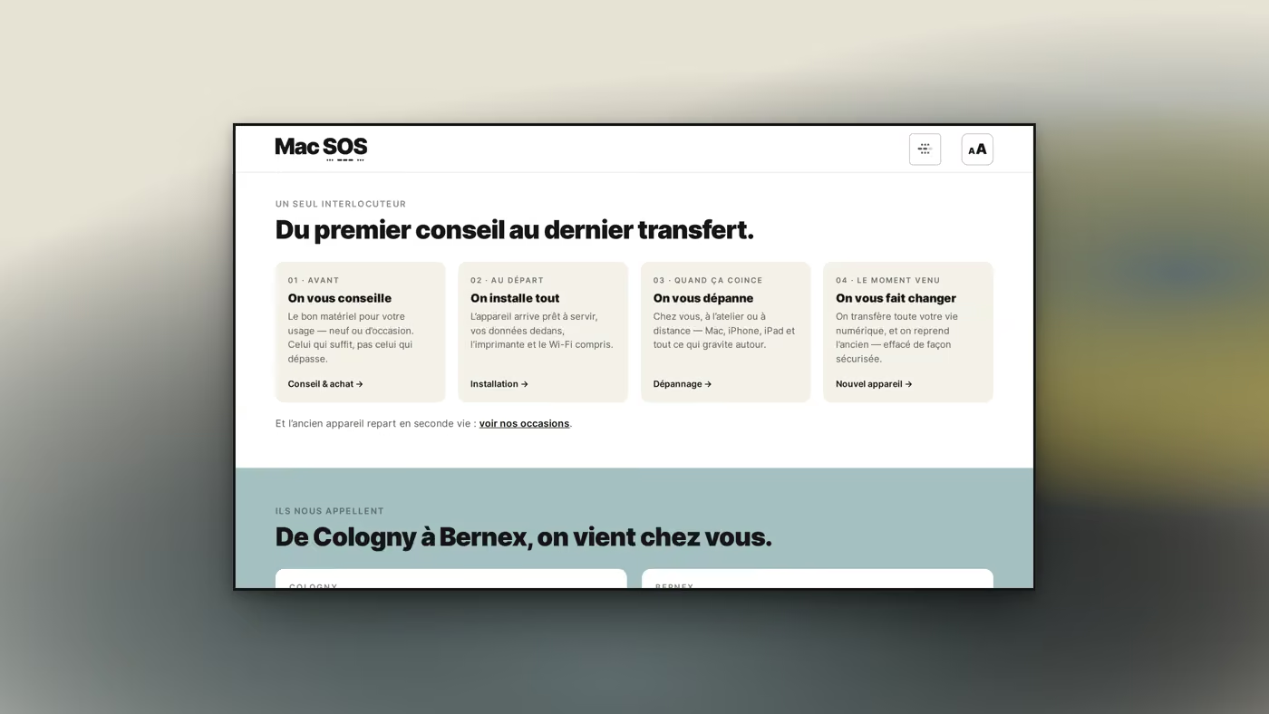
Visual“From the first advice to the last transfer.” Four cards numbered 01 to 04, each with its moment: before, at the start, when it jams, when the time comes. The client’s journey is written as a duration, not as a catalogue.
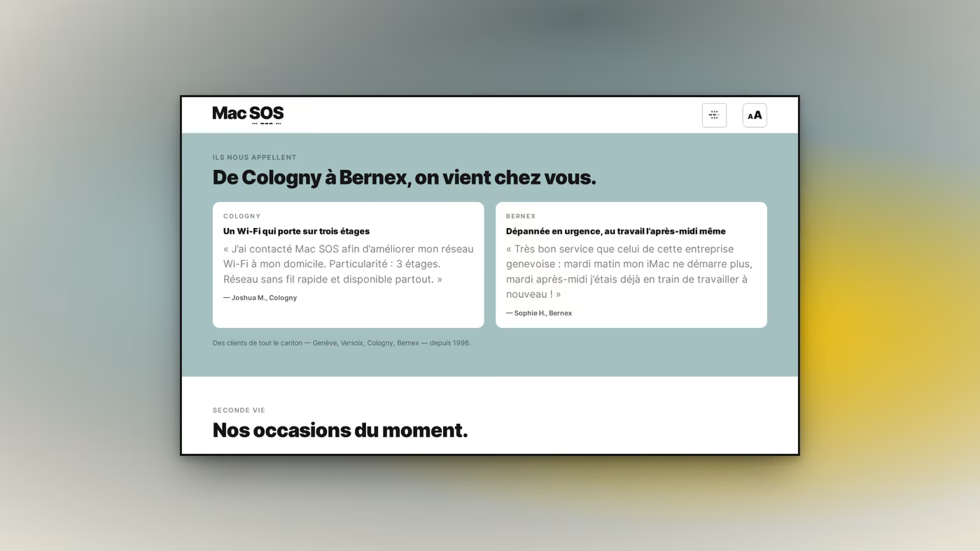
VisualThe testimonials. Two only, and each names its village: Cologny, Bernex. The section heading does the rest of the work: “From Cologny to Bernex, we come to you.” An anonymous review does not prove that anyone travels.
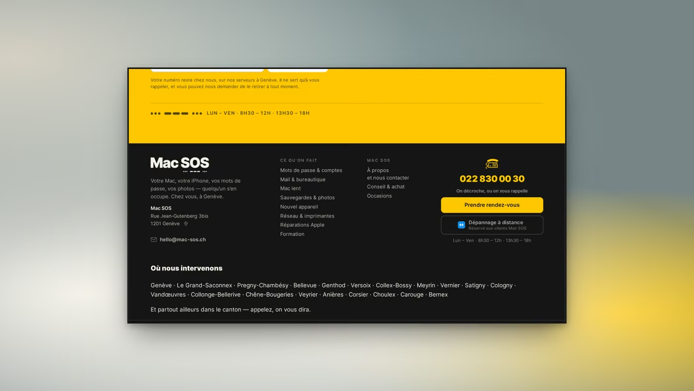
VisualThe footer. It lists the twenty municipalities Mac SOS travels to, spelled out in full: it answers the visitor asking “what about my area?” and it is the one place on the site where the coverage reads at a glance. The morse of SOS returns under the name, at the bottom, like a signature.
Built · 02

Interface — desktop

The visitor does not know the name of the fault. So the site was built around what they feel, not around what is sold.
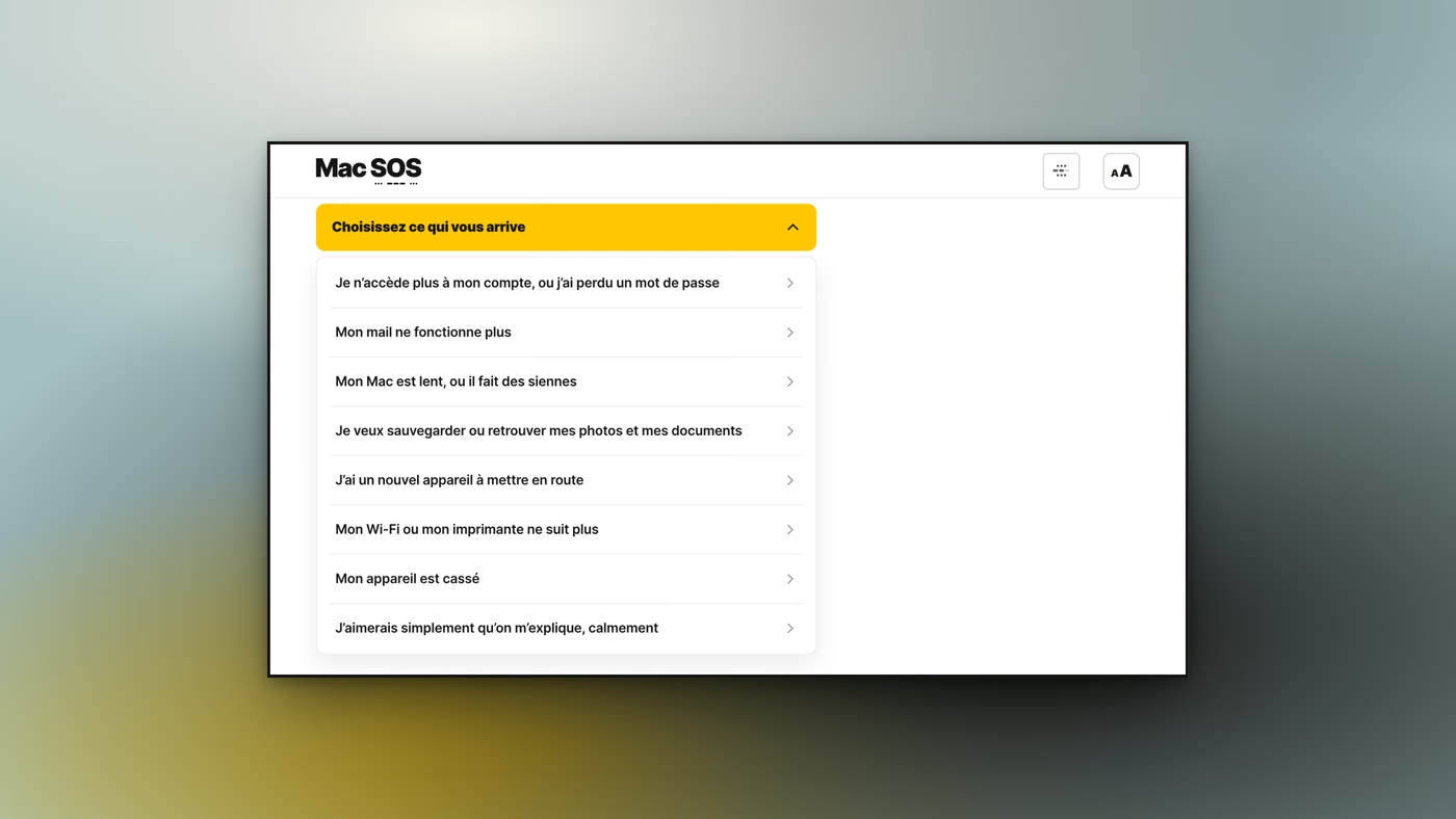
VisualThe selector, open. Eight first-person sentences: “My mail no longer works”, “I would simply like it explained to me, calmly”. None uses a trade word, and each leads to its own page.
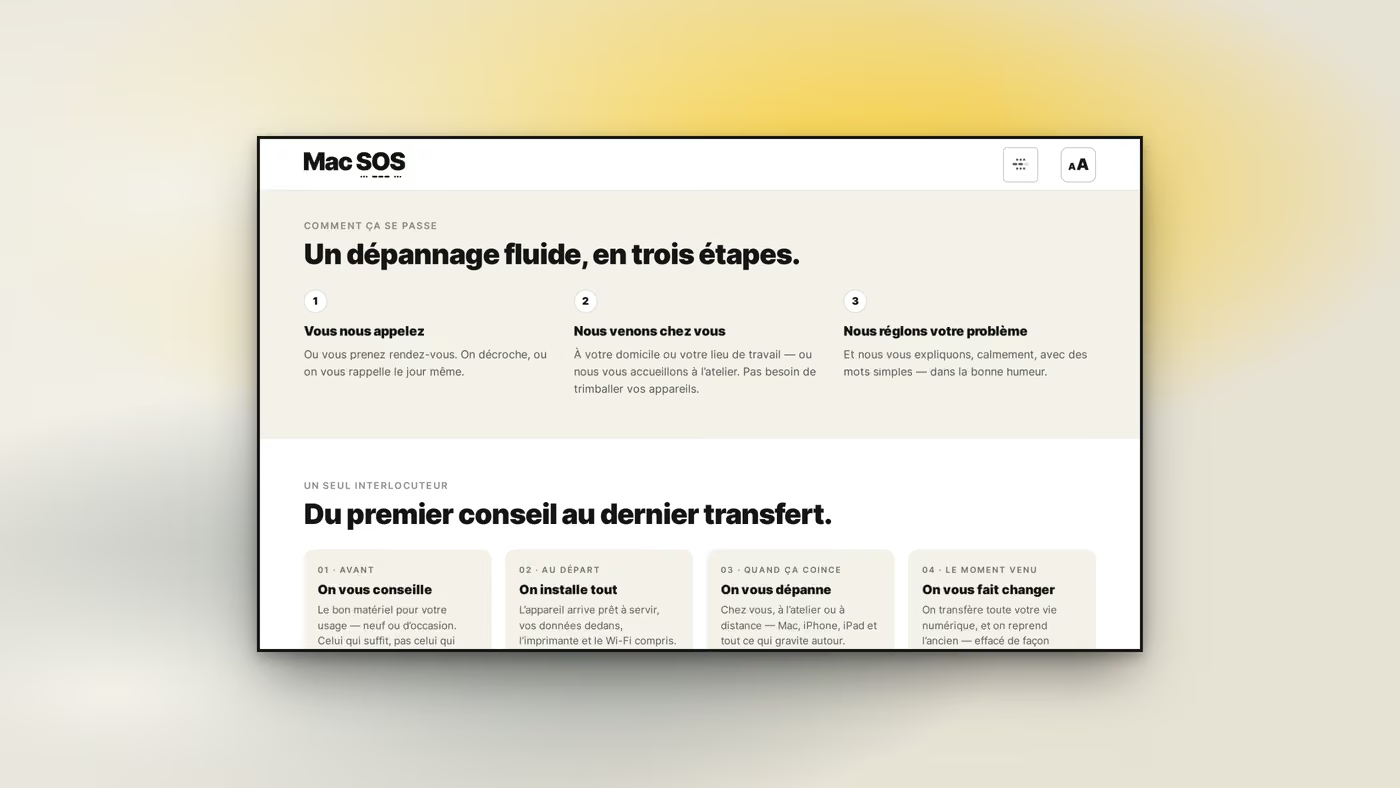
VisualThe three steps. You call, we come, we fix, and the third one says “we explain it to you, calmly, in plain words”. The promise the rest of the site keeps fits in one line here.
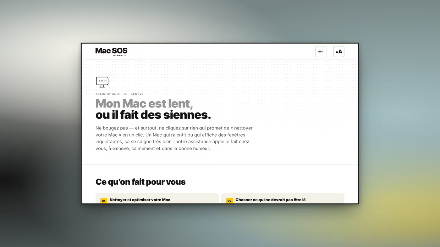
VisualA problem page, at its opening: “My Mac is slow, or it is acting up.” The heading repeats the selector’s sentence word for word: the visitor who clicked recognises their own words and knows they landed right.
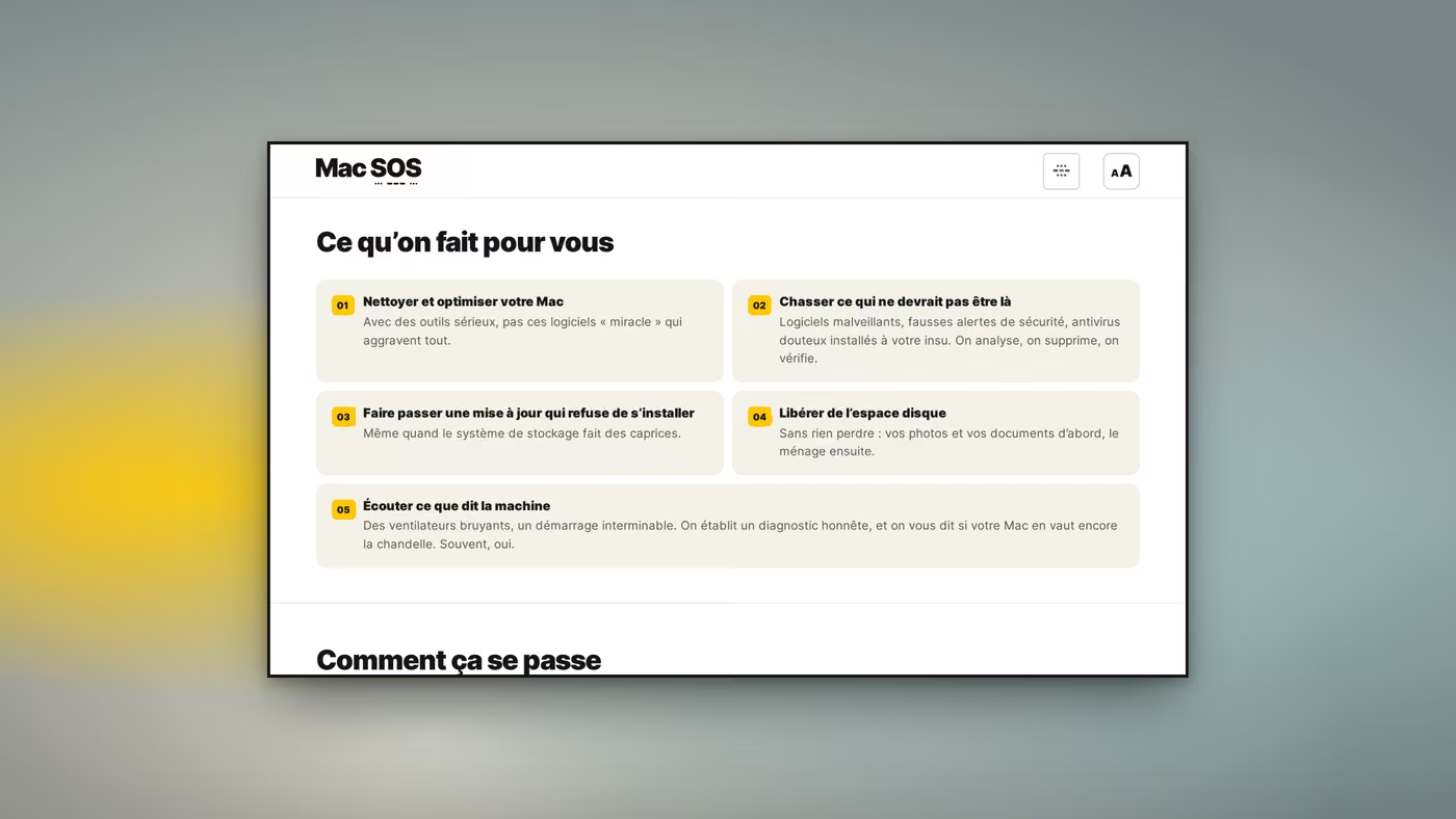
VisualThe same page, further down. “What we do for you” sorts the actions into cards numbered 01 to 05, and the first defuses the scam before selling anything: “with serious tools, not those ‘miracle’ programs that make it worse”.
Built · 03

Interface — mobile

A broken Mac gets searched for from a phone. So the pages were redrawn for the narrow screen, not shrunk.
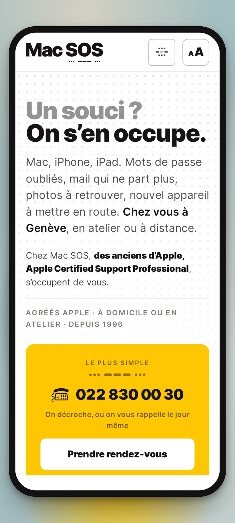
VisualThe home screen on a phone. The name and its morse hold the bar, with only two buttons beside them: the menu, and the text size. The yellow number block drops below the text: no longer alongside, now within thumb reach.
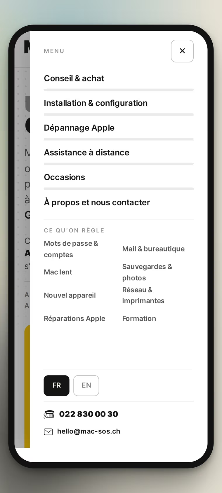
VisualThe open menu. Six main entries, then “What we fix” in two columns: the selector’s eight problems are here too, because a visitor who opens the menu is often looking for their fault, not a section.
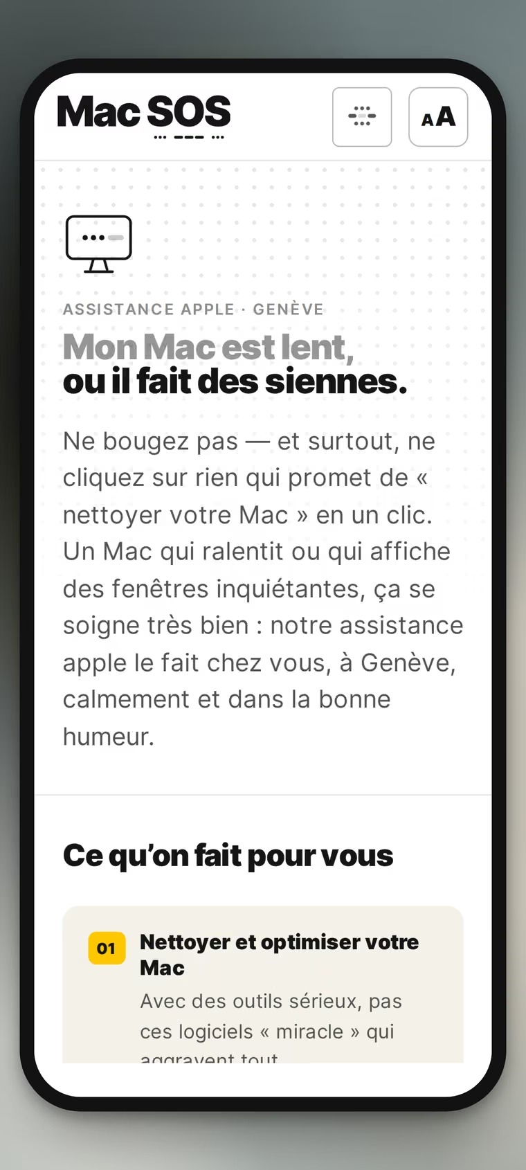
VisualA problem page on a phone. The heading keeps its two weights, grey then black, and the text goes to one wide column, without the line getting so short that reading breaks up.
VisualThe home screen on a phone, dark. The face follows the choice made in the reading-comfort panel, and it stays on the device: it says so in full under the setting.
Built · 04

Development

Three forms, one reading setting, no dependency on a third-party service. What the visitor is asked for is the strict minimum, and where it goes is stated.
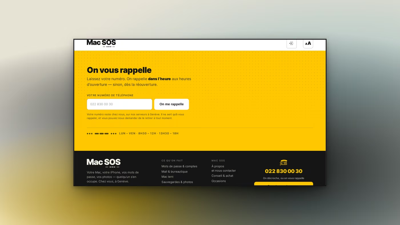
VisualThe callback. One field, one button, and beneath them the sentence that is missing almost everywhere: where the number stays, what it is used for, and how to have it removed. The opening hours close the block, because a callback promise without hours is not one.
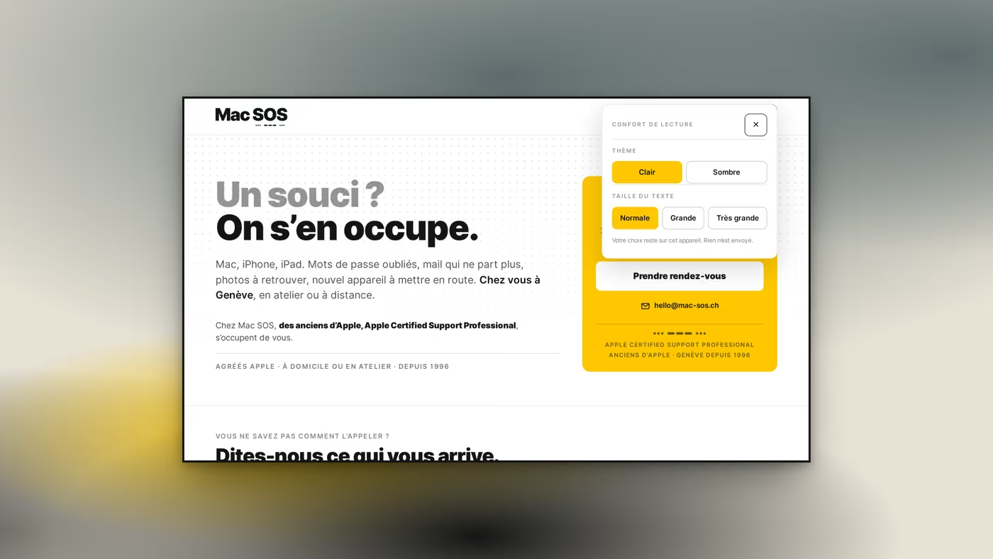
VisualThe “Reading comfort” panel. Light or dark theme, and three text sizes: normal, large, very large. Under the settings, one sentence: “Your choice stays on this device. Nothing is sent.” That is accessibility, and it is also a stance.
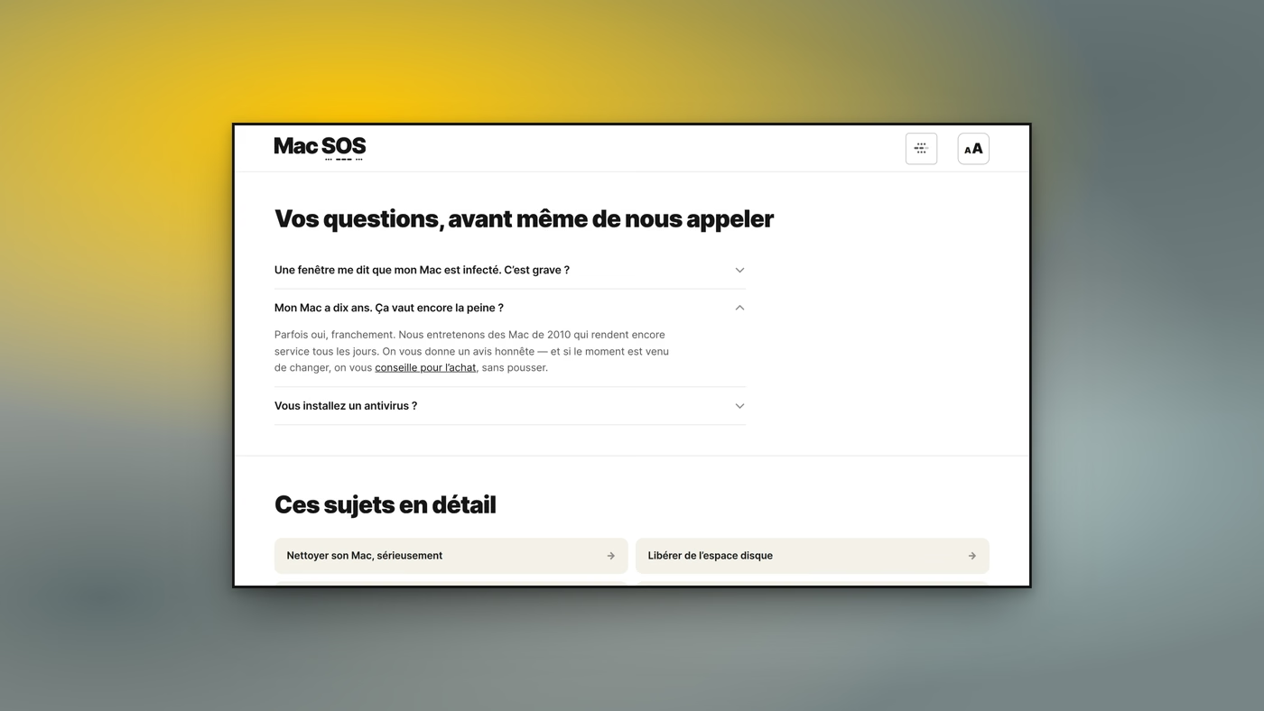
Visual“Your questions, before you even call us.” The objections are written the way clients raise them (including “My Mac is ten years old. Is it still worth it?”), and the answer opens with “Sometimes yes, frankly”, before pointing to the buying advice.
Found · 05

Coming in from search

One page per problem, and its English mirror. Nobody enters this site by the home page: they enter by their fault.
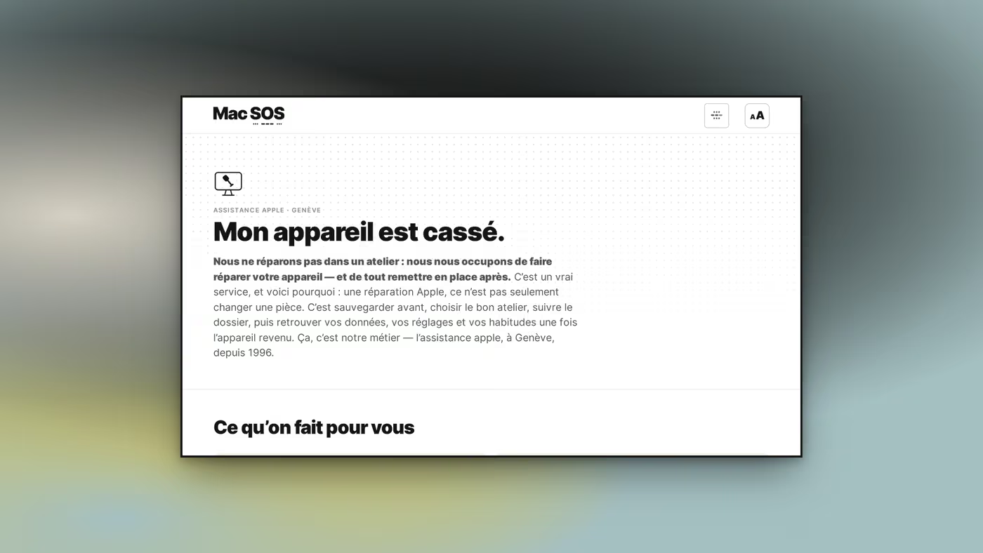
VisualThe repairs page. It opens with what Mac SOS does NOT do (“We do not repair in a workshop”), before saying what the service really is: getting it repaired, and putting everything back afterwards. A page that declines first reads as an honest page.
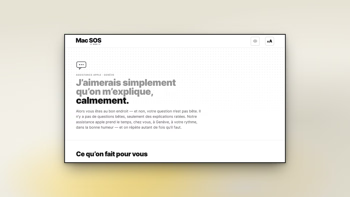
VisualThe training page, and it is the gentlest of the set: “I would simply like it explained to me, calmly.” The answer opens with “your question is not a silly one”: that is the brand’s tone, held all the way into the page title.
Welcome to the Machine
Client access · one address, one password per space
Your client space↗espace.wttm.ch
WTTM Rue Jean-Gutenberg, 3bis, 1201 Genève InstagramBehanceAwwwards Legal · Privacy · © 2026
Search this siteSearch/