Search this site/
Projects — 04 / 05

Luigi di Moncello

The identity, packaging and online shop of an artisanal Geneva limoncello: everything starts from the bottle, and what you read on it.

Period2023PlaceGeneva · Switzerland
RoleThe whole chainLiveluigidimoncello.ch
CraftsIdentity · Print · Interface · Development · Digital marketing
DeliveredBrand, packaging, online shop, stationery, in-store displays

Luigi di Moncello is a craft limoncello sold in Geneva and across Switzerland: restaurants, hotels, retailers. The brand had to hold its own on a shelf beside long-established Italian houses. The name is handwritten, the label is small, and the lemon is never drawn, it is photographed.

The project, in pictures ↓
The product

What is seen first

The case, the bottle, the lemons. Photographed together, never cut out.
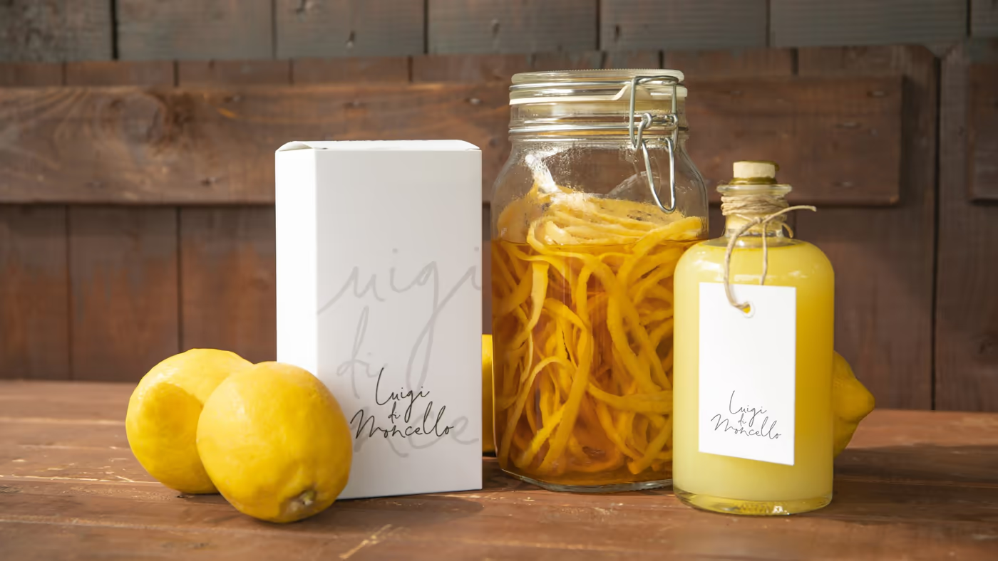
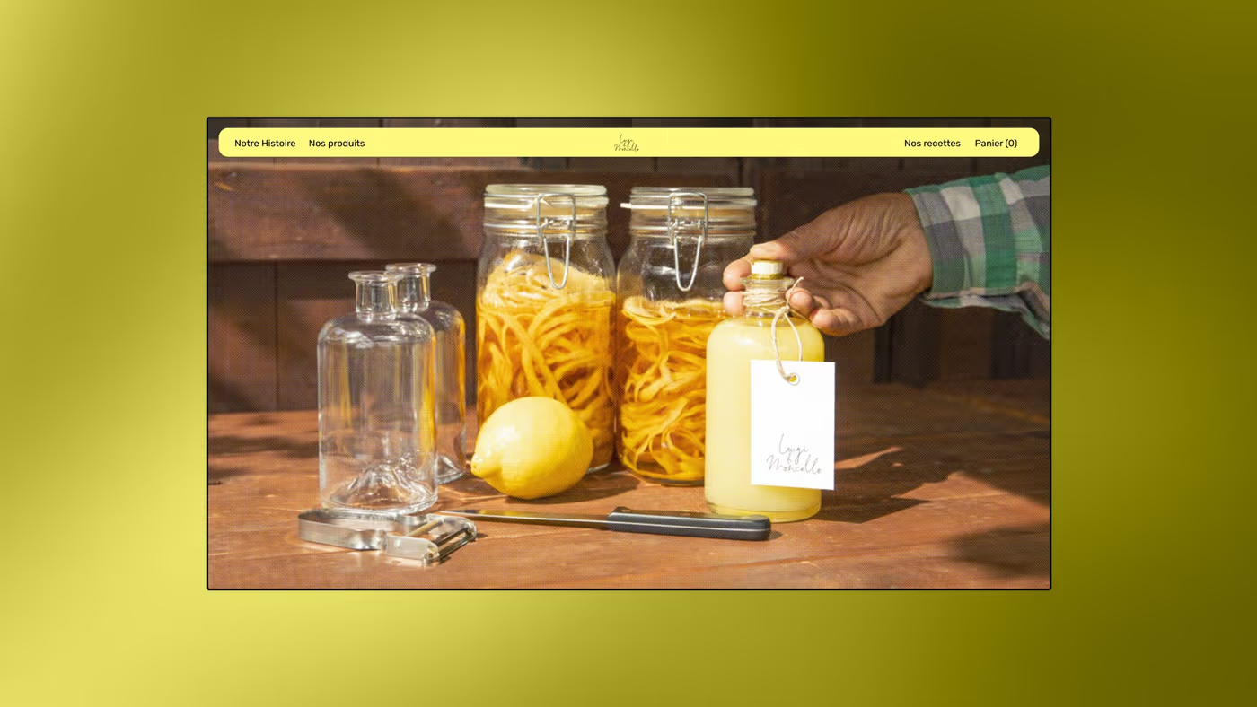
VisualThe reference still life: the case, the jar of zest, the bottle and two lemons, on raw wood. This is the image that sets the register: something made, not a luxury flask.
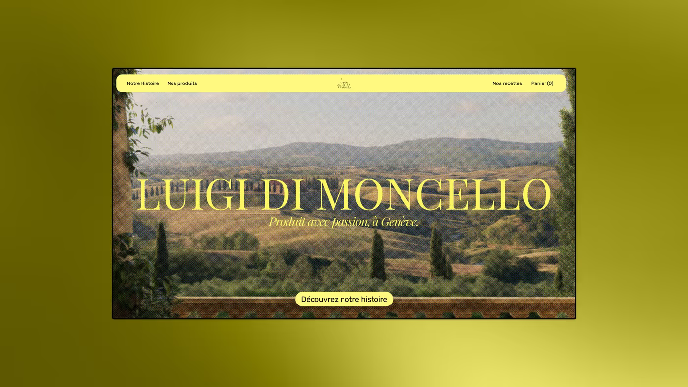
VisualThe home screen. The name in capitals over a landscape of hills, and one button only: discover the story. Nothing to buy on this first screen.
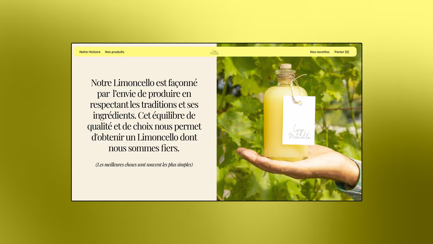
VisualHow it is made, said in three sentences, next to a hand holding the bottle in the vines. The text speaks of ingredients and tradition; the image proves it.
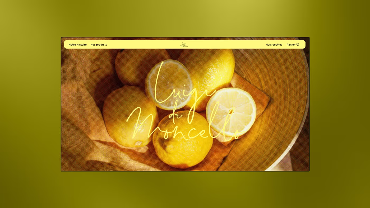
VisualThe lemon banner, handwritten logotype overlaid. The signature is thin and white: it crosses the photograph without cutting it.
The story

Thirty years later

The site tells where the recipe comes from before selling it. It is the only part of the journey where the text runs long.
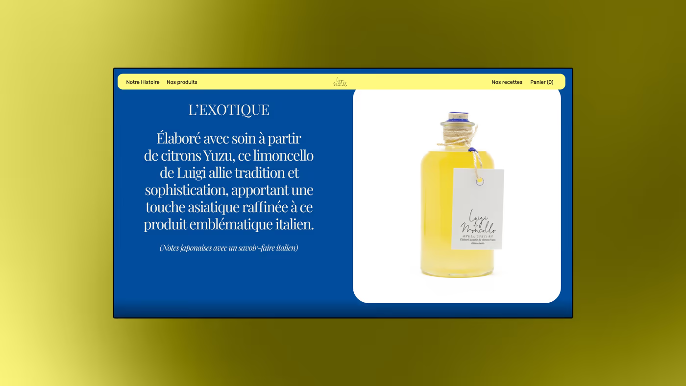
VisualThe “L’Exotique” page on blue. Blue is the brand’s second colour: it separates the varieties without changing the label.
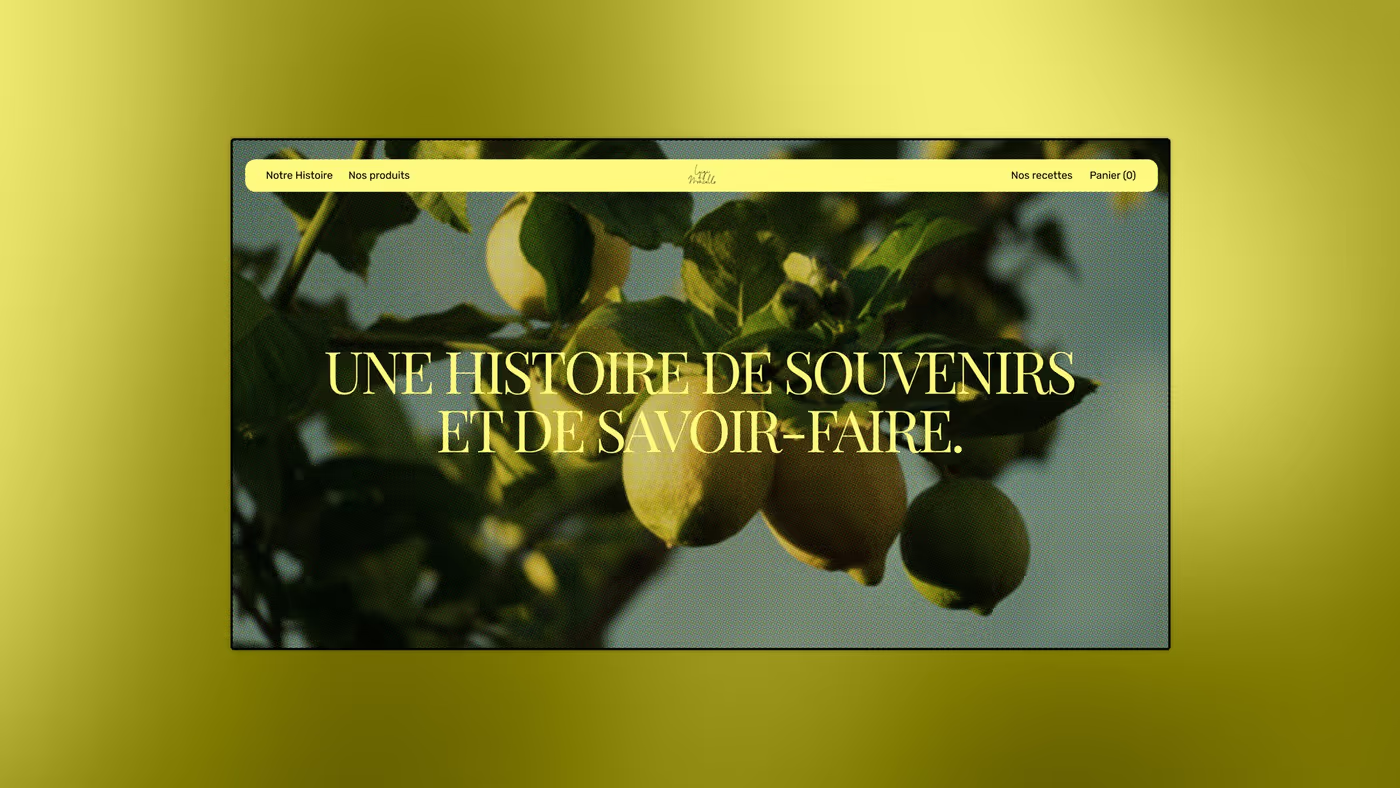
Visual“A story of memories and craft”, set in a didone over a lemon tree. The heading is in white capitals, with no box behind it.
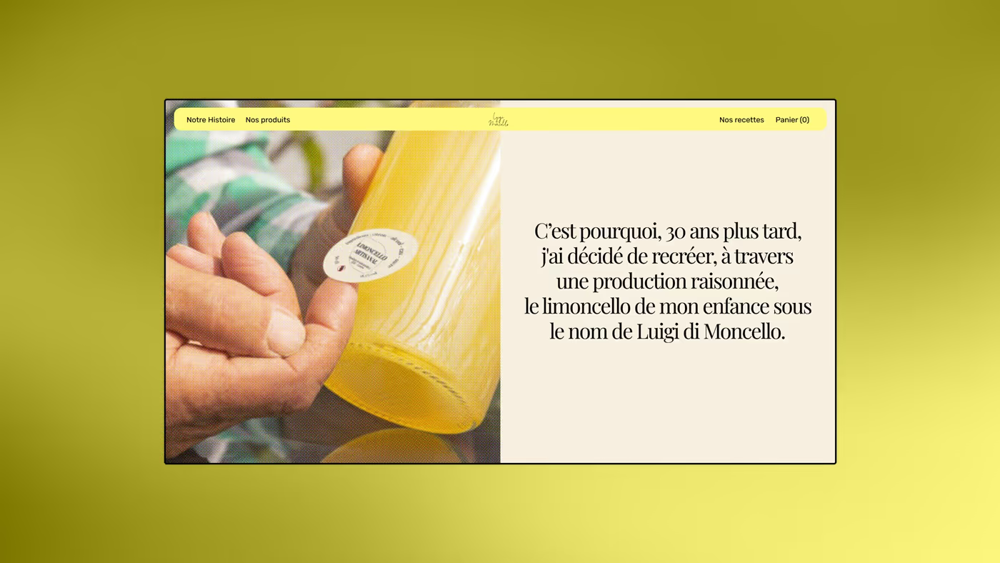
VisualThe first-person account: thirty years on, remaking the limoncello of a childhood. Text right, hand left: you read, then you see.
VisualThe workshop: jars of zest macerating, a whole lemon, a filled bottle. No gloved hands, no laboratory set.
The shop

The online shop

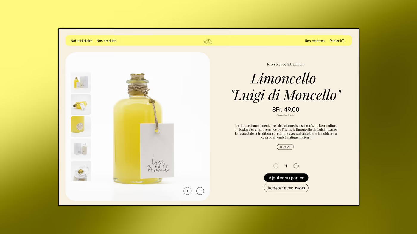
One bottle, one price, one button. The product page offers no choice that does not exist.
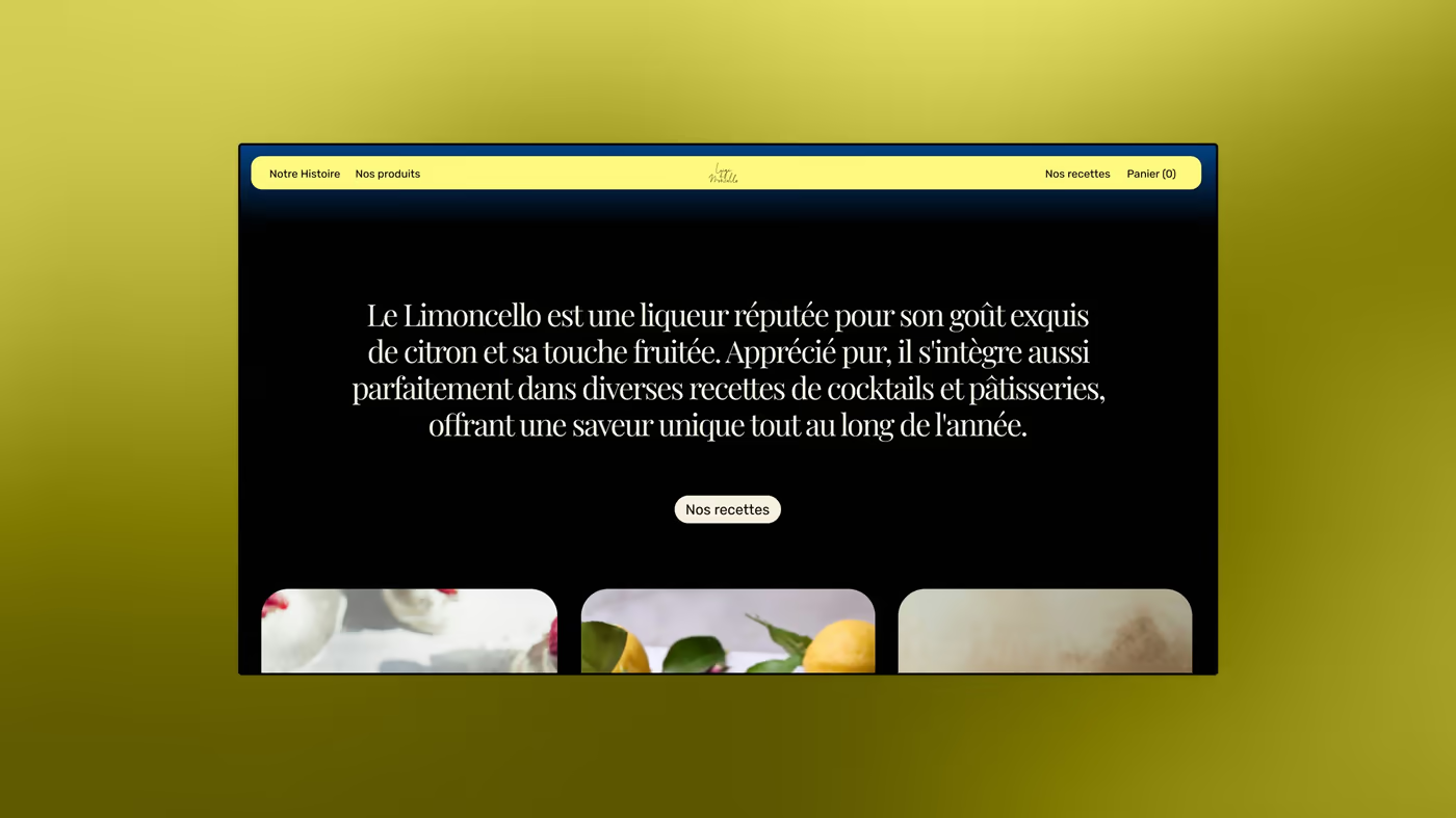
VisualThe dark section explaining what a limoncello is and how it is drunk. Three images below, at one height.
VisualThe product page: bottle large, thumbnails left, price in francs, add to basket and express checkout. The ground stays cream, the product carries the colour.
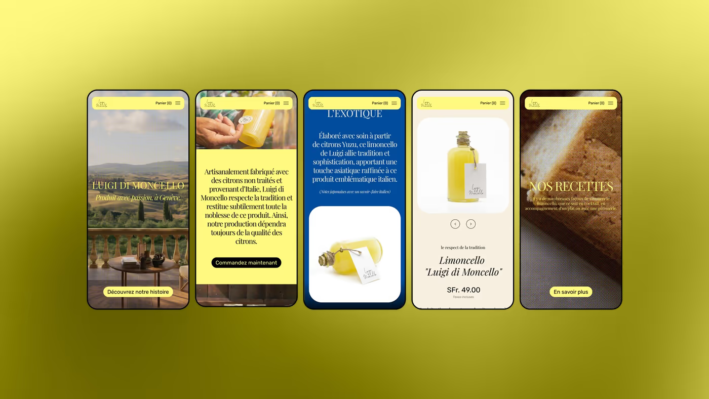
VisualFive phone screens: home, the blue variety, the product page, the story. The price stays readable without zooming.
The object

What is held in the hand

Print and packaging. Half of the work, and the half that is judged without a screen.
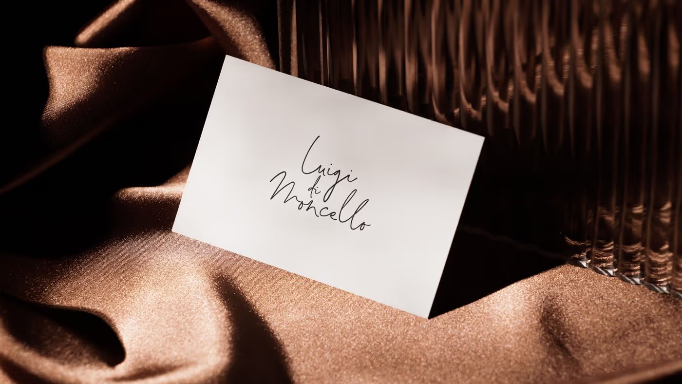
VisualThe card, handwritten, on brown cloth. The name is the only thing printed: no title, no role.
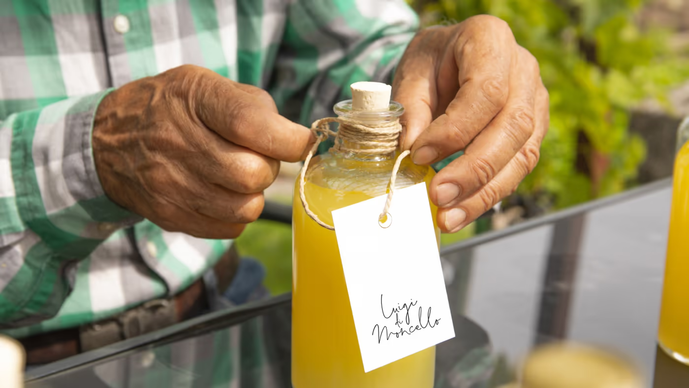
VisualThe tag is tied by hand at the neck. It is not glued: that detail says craft better than any claim.
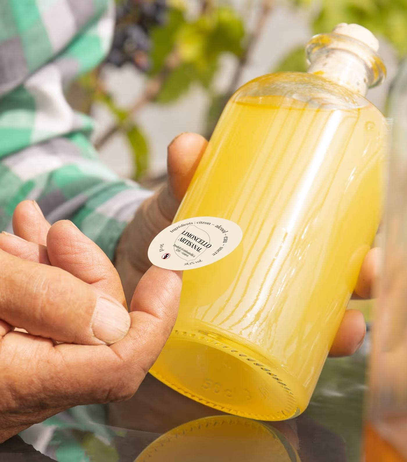
VisualThe bottle in hand, medallion visible. The glass is bare, no sleeve, no film: the colour of the product is the colour of the brand.
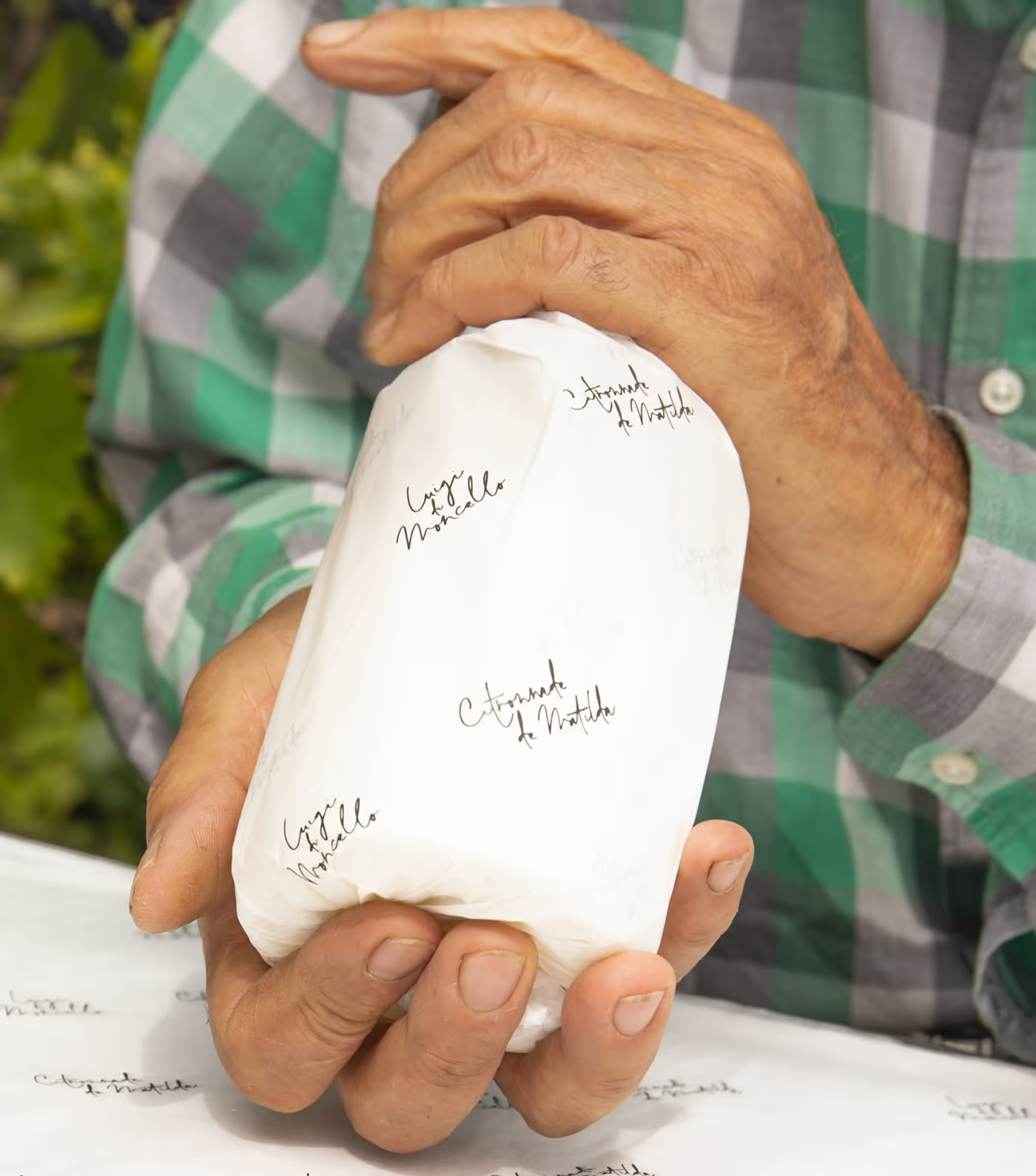
VisualThe white case, held in two hands. The handwritten signature runs across the face; the board is not laminated.
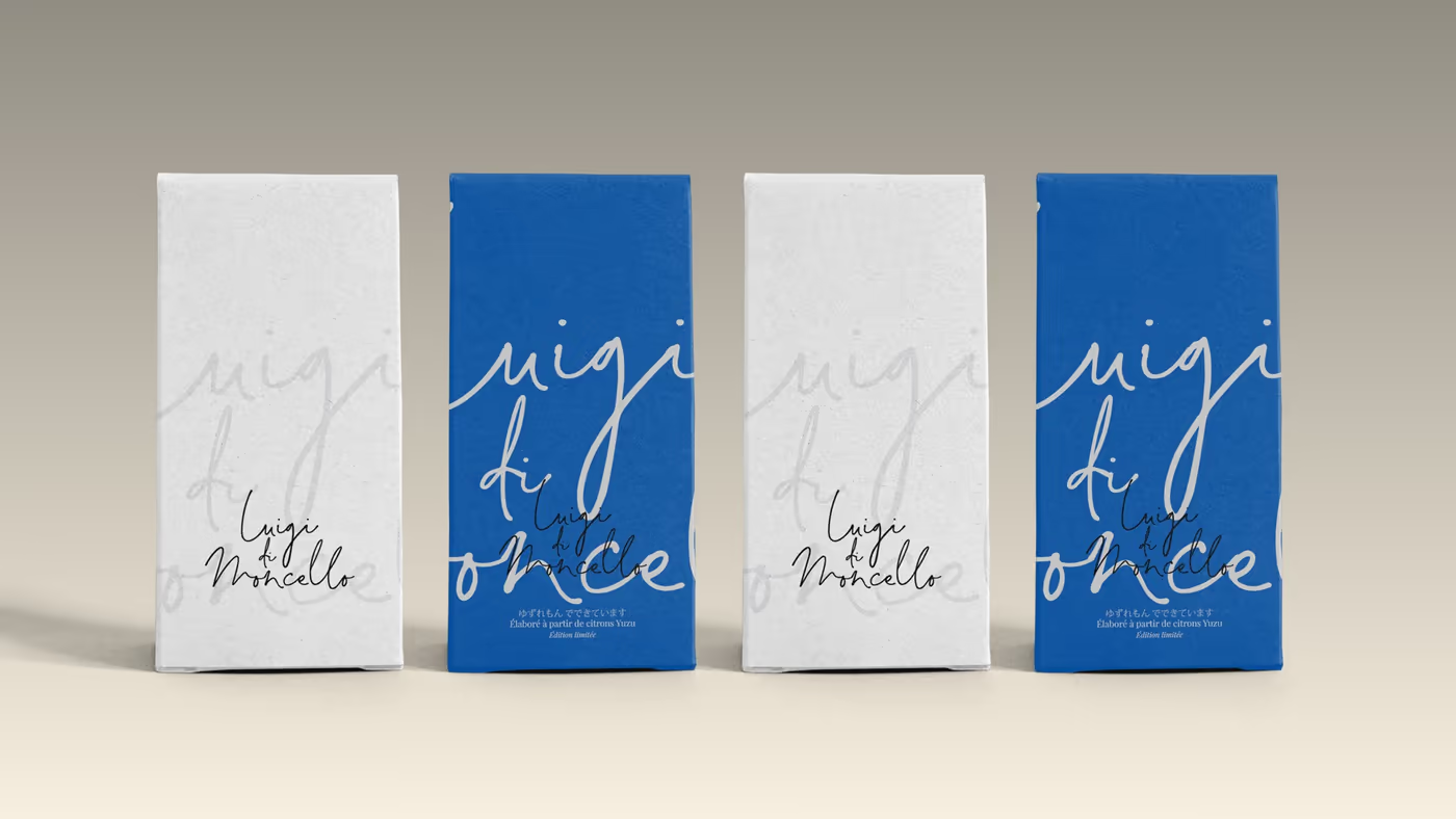
VisualThe four cases in a row, two white and two blue. That is the whole range: colour is enough to tell them apart, the name does not change.
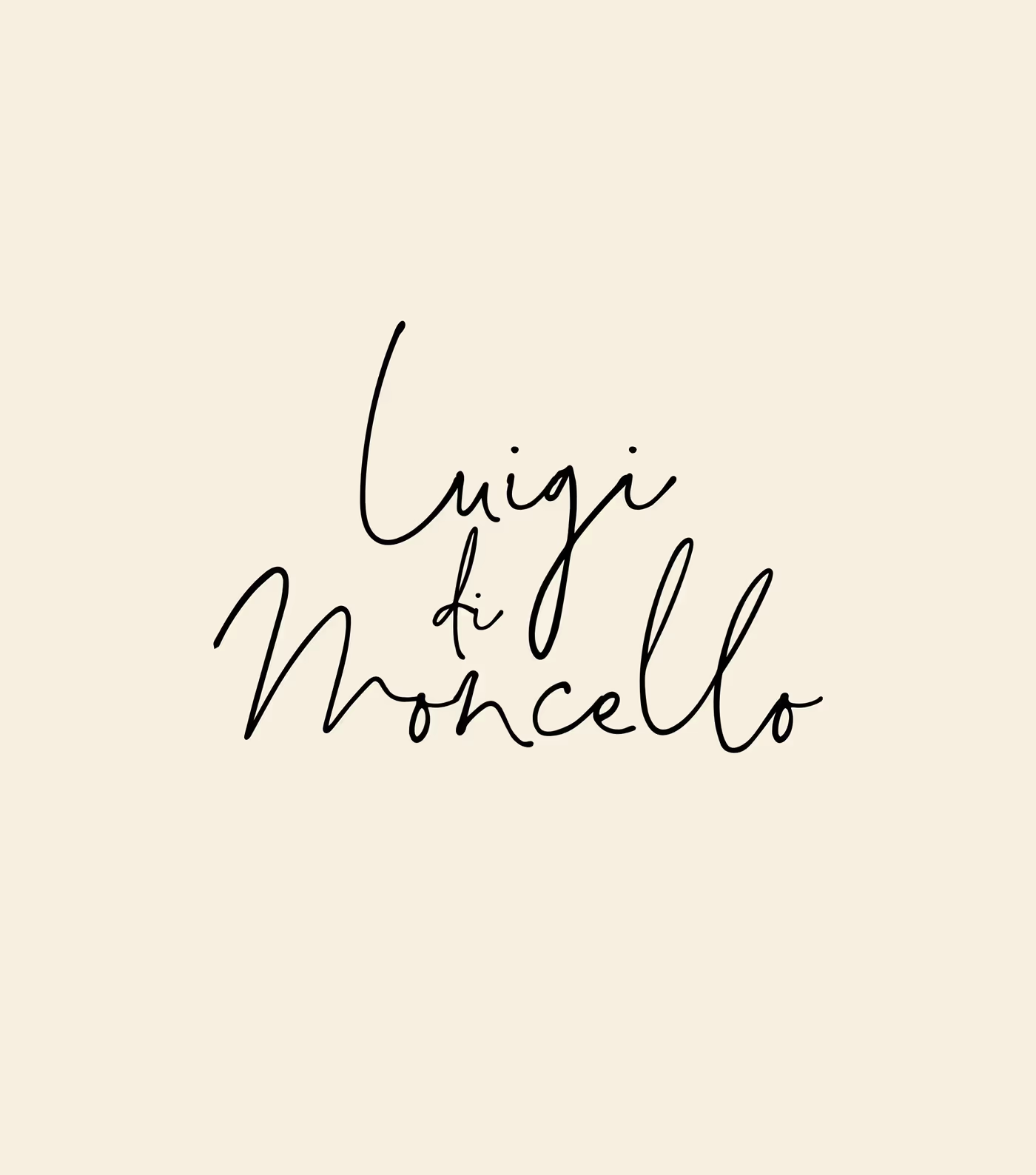
VisualThe logotype alone, on cream. Handwritten, over three lines, unstraightened: it is a drawing, not a typeface.
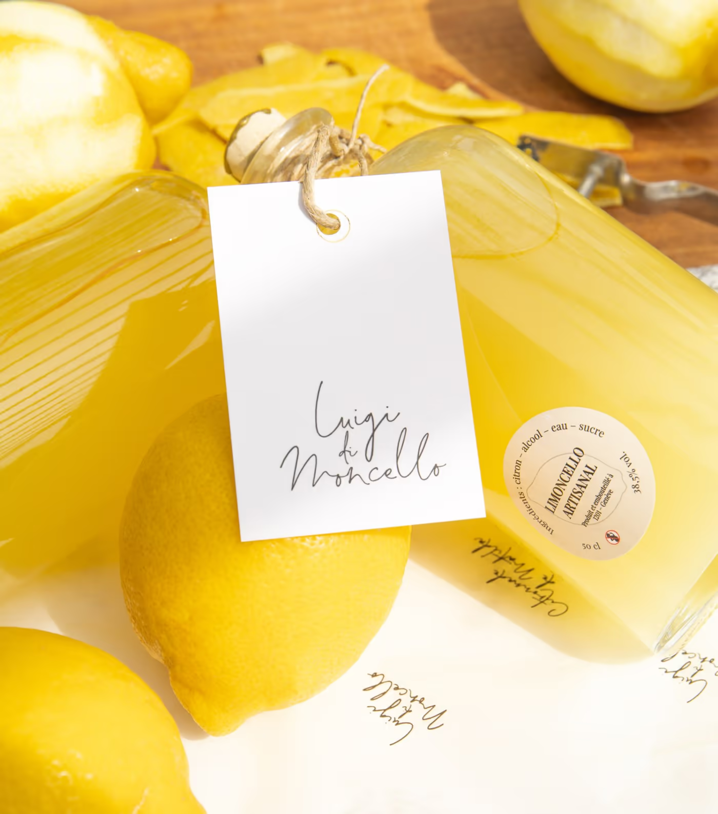
VisualThe bottle lying among the lemons, tag and medallion legible. This is the shelf image: it has to hold at small size.
The rule

What holds the brand

Two typefaces and four colours fix the brand; the hand, the lemon and the glass do the rest.
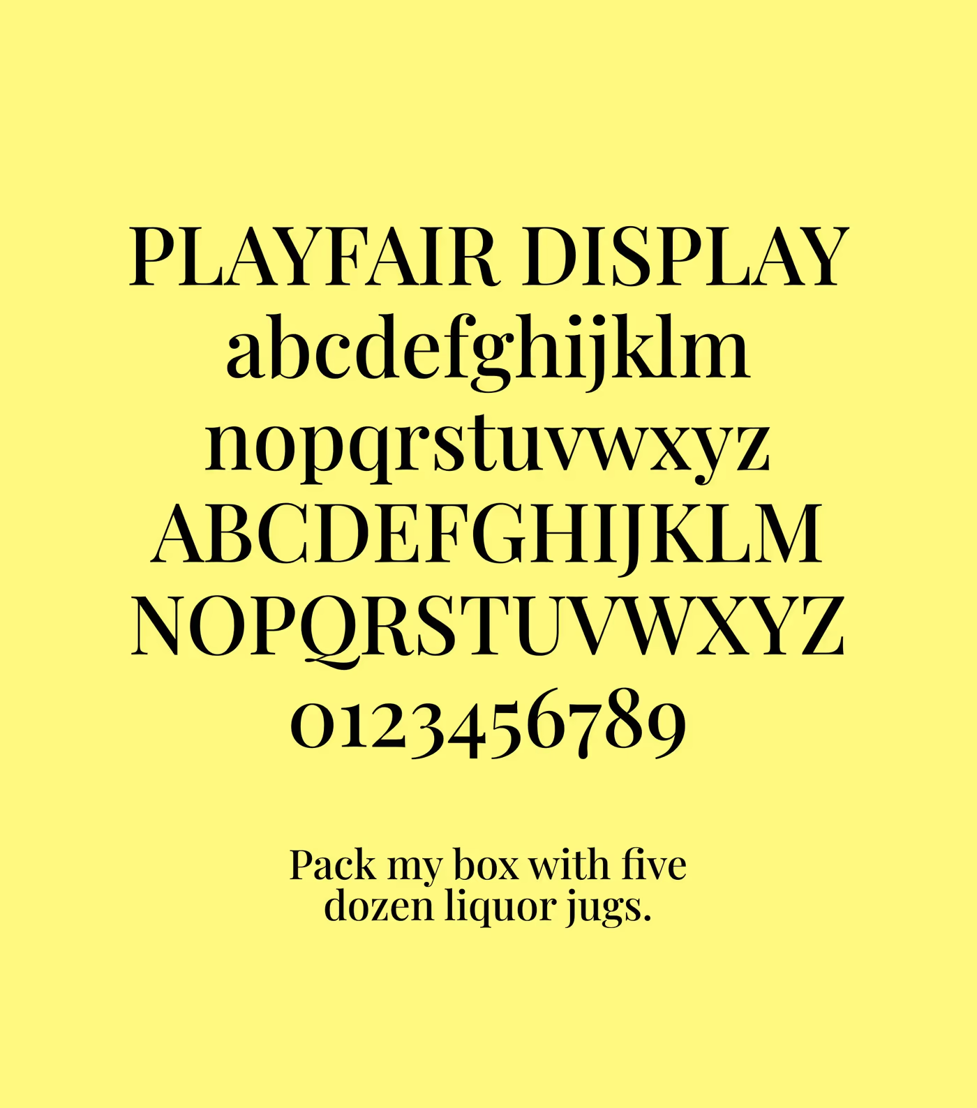
VisualPlayfair Display, for headings. A high-contrast didone: it holds the Italian register without going through pastiche.
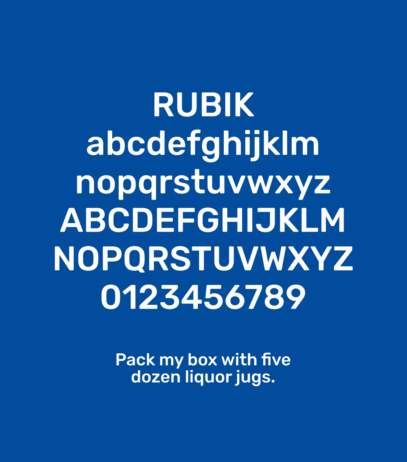
VisualRubik, for running text and the shop. On blue, it is the one carrying prices and buttons.
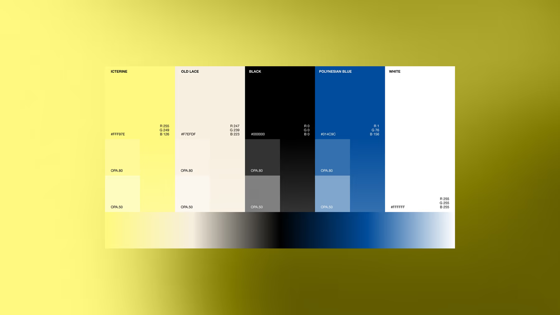
BoardThe colour board. The blue is the one on the cases and in the shop: the colour you recognise before reading the name.
the lemon
the blue
the cream
the black
Playfair Displayheadings · didone
Rubikrunning text · shop
Welcome to the Machine
Client access · one address, one password per space
Your client space↗espace.wttm.ch
WTTM Rue Jean-Gutenberg, 3bis, 1201 Genève InstagramBehanceAwwwards Legal · Privacy · © 2026
Search this siteSearch/