Search this site/
Projects — 01 / 05

OGGO

Apple IT consulting in Geneva since 2010. A brand and a site rebuilt from scratch, then measured down to the last section.

Period2024–2026PlaceGeneva
RoleThe whole chainLiveoggo.ch
CraftsIdentity · Print · Interface · Development · Digital marketing
DeliveredBrand, site, measurement, campaigns

Nothing was recovered. Identity, grid, typography and site were rebuilt from zero, then measured, screen by screen, until not a single section was cut off.

The project, in pictures ↓
Designed · 01

Art direction

The logotype, the typography, the stationery and the objects: a brand designed to hold off-screen too, on a card, a t-shirt, a sign.

VisualThe logotype in its four states: solid, outlined, on light, on dark. The four letters sit in a two-by-two square: that is what lets it become a favicon without losing anything.
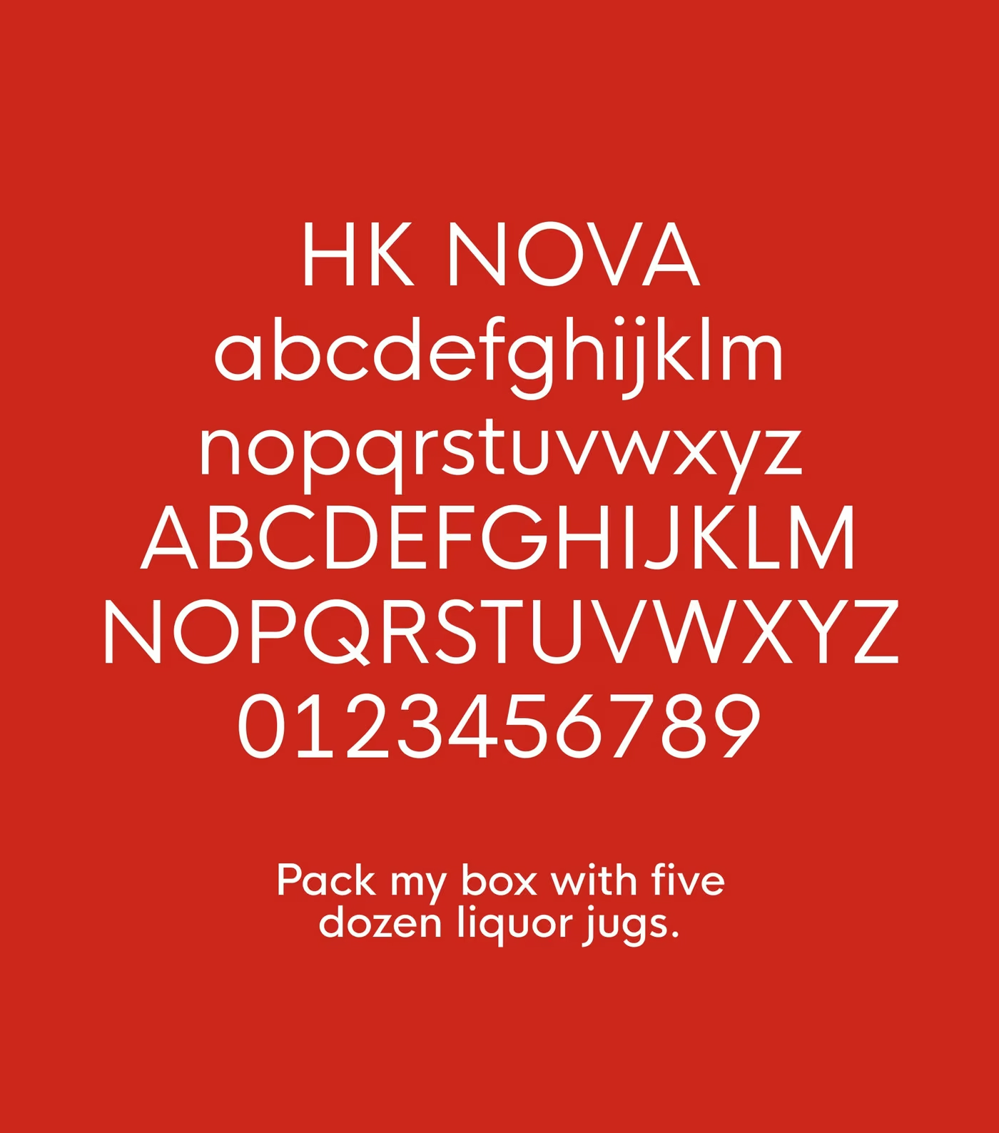
VisualThe HK Nova specimen on OGGO red. It carries the large headings; running text switches to SF Pro, Apple’s system face, a coherence choice with the client’s trade, not a matter of taste.
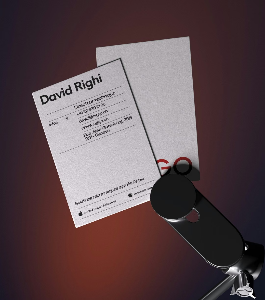
VisualThe stationery. The card carries no tagline and no service list: a name, a role, a number. It is what you hand over at the end of a meeting, not a brochure.
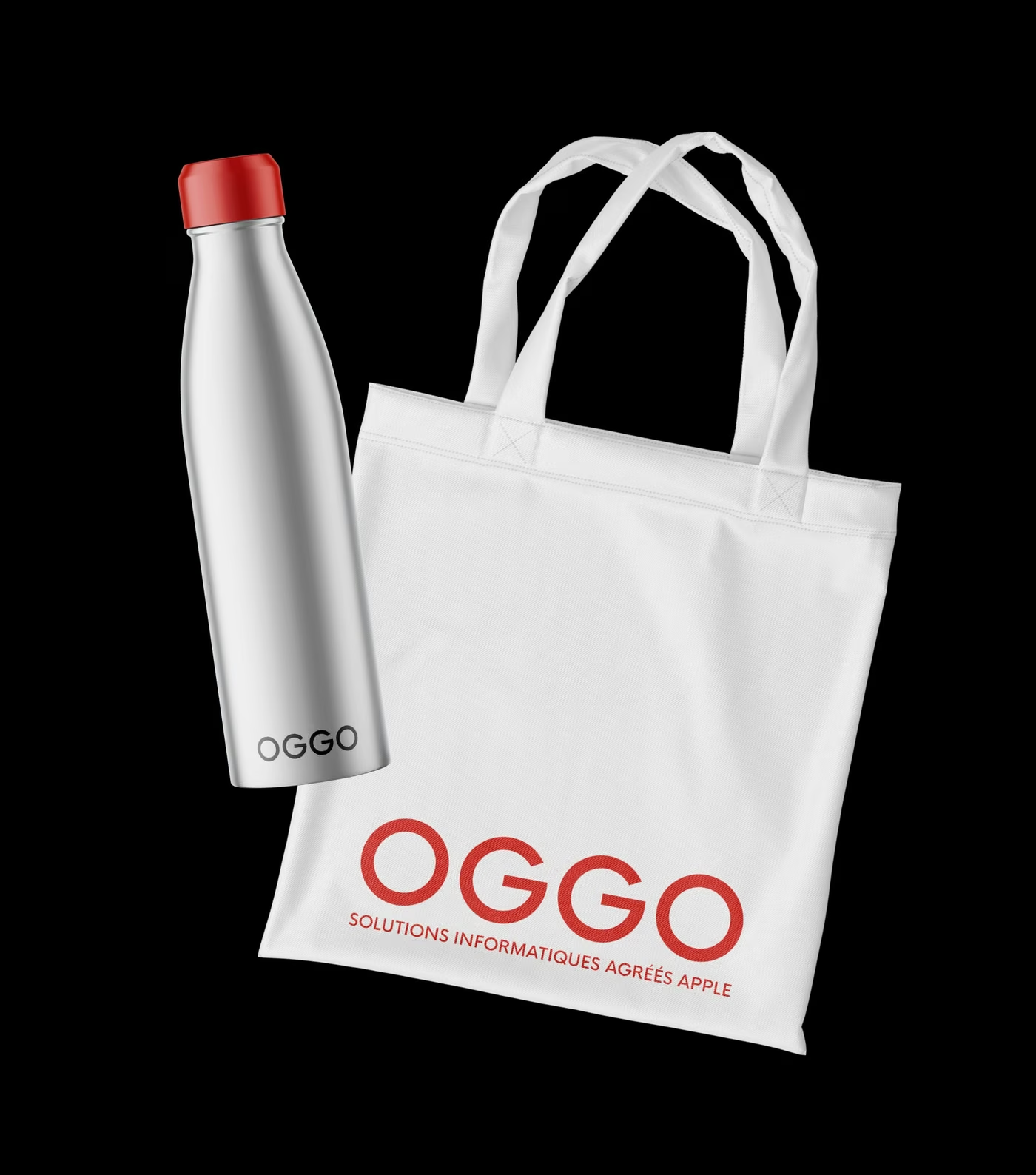
VisualThe objects. The logotype goes flat here, no gradient, no relief: the constraint comes from printing on fabric and metal, and it doubled as a test: a brand that survives screen printing survives anything.
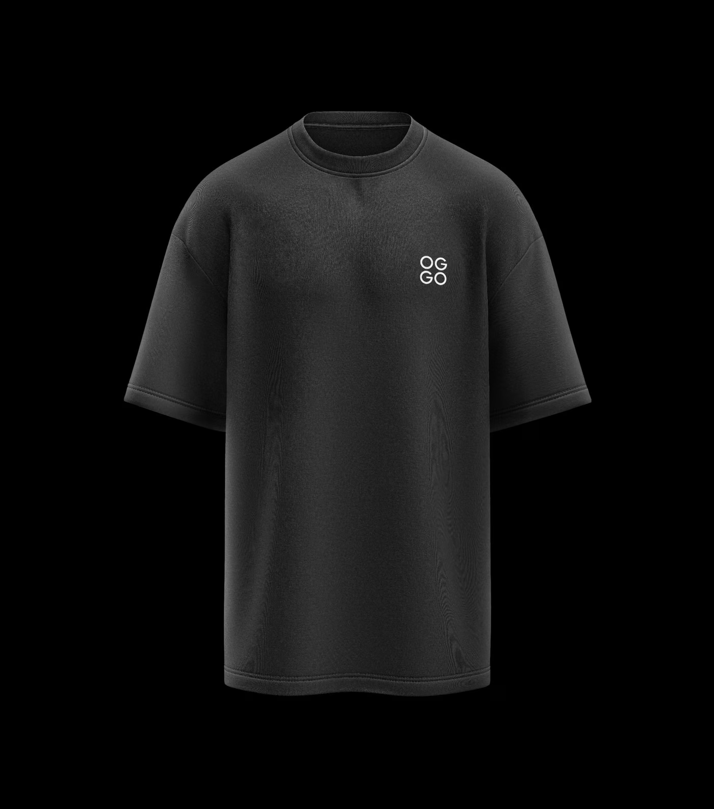
VisualThe team t-shirt. The logotype shrinks to badge size and sits high on the chest: worn by a technician at a client site, it must read from a distance without ever shouting.
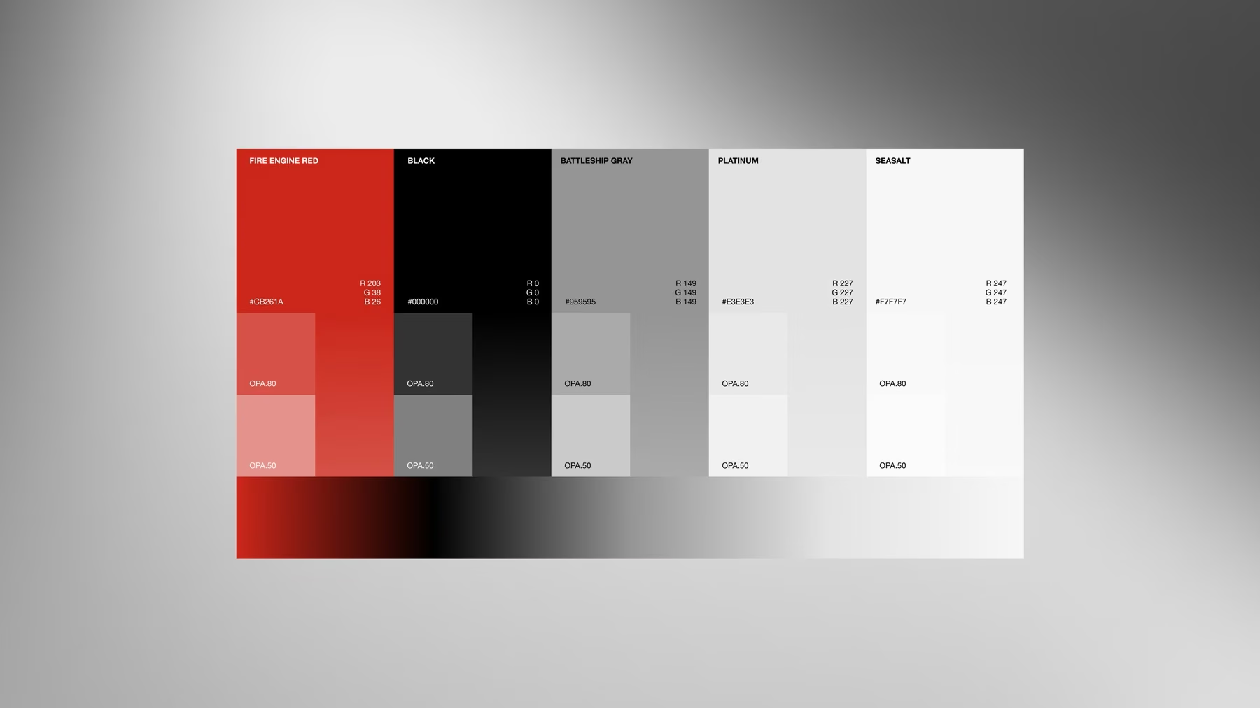
VisualThe technical board. It fixes colour, typography and their variants: it is the reference that settles things the day a printer, a supplier or a developer asks for the exact values. The precise values are not published here: they live in the client space, at an address that does not move.
the red
the black
the text grey
the surface grey
HK Novalarge headings
SF Prorunning text · Apple system
Built · 02

Interface — desktop

OGGO’s site on a large screen, where its clients read it most.
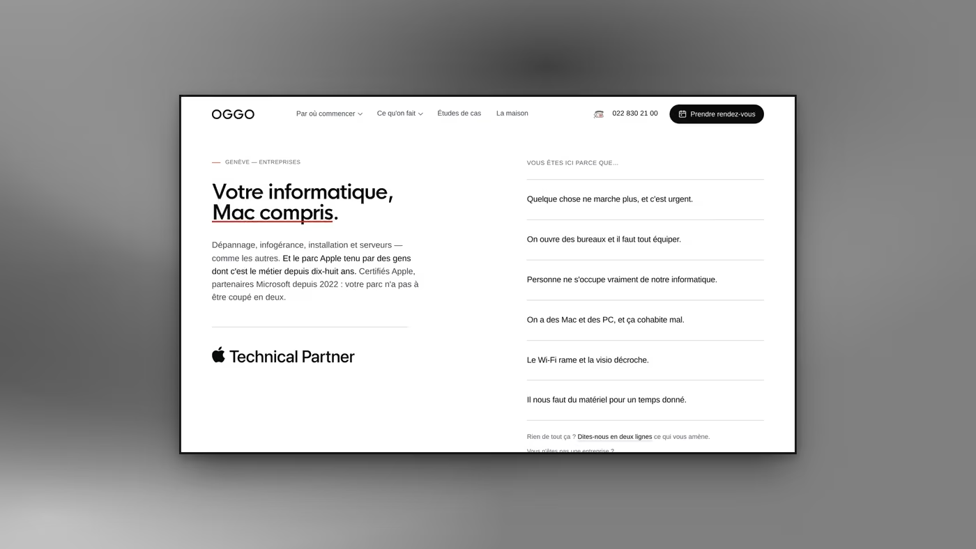
VisualThe home page. A two-line promise with two words underlined (“Mac compris”), and facing it a column that sells nothing: six client sentences, written the way a client would say them. The visitor recognises their own situation before we have said a word about ourselves.
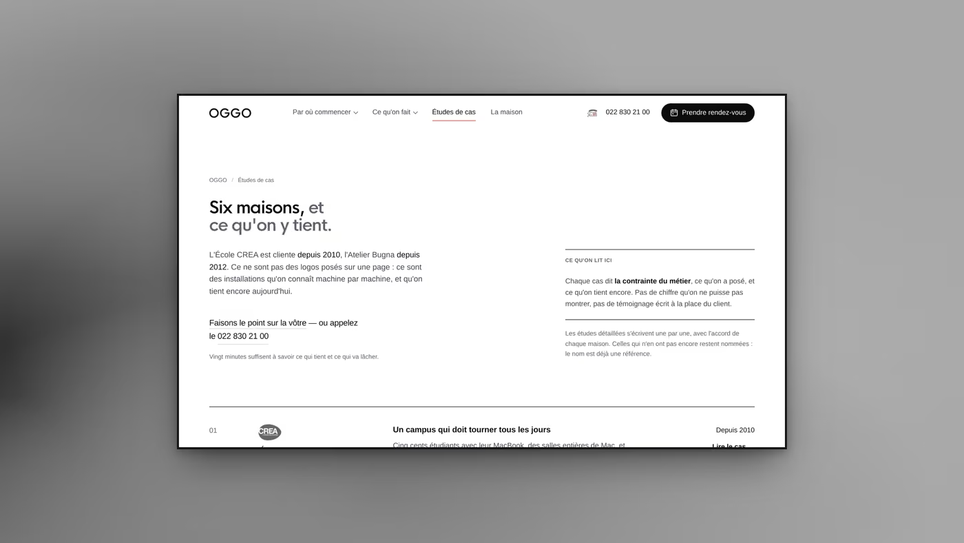
VisualThe case studies. The heading counts six firms, and the panel beside it states what we will not do: no figure we cannot show, no testimonial written on the client's behalf. A references page that opens with its own limits.
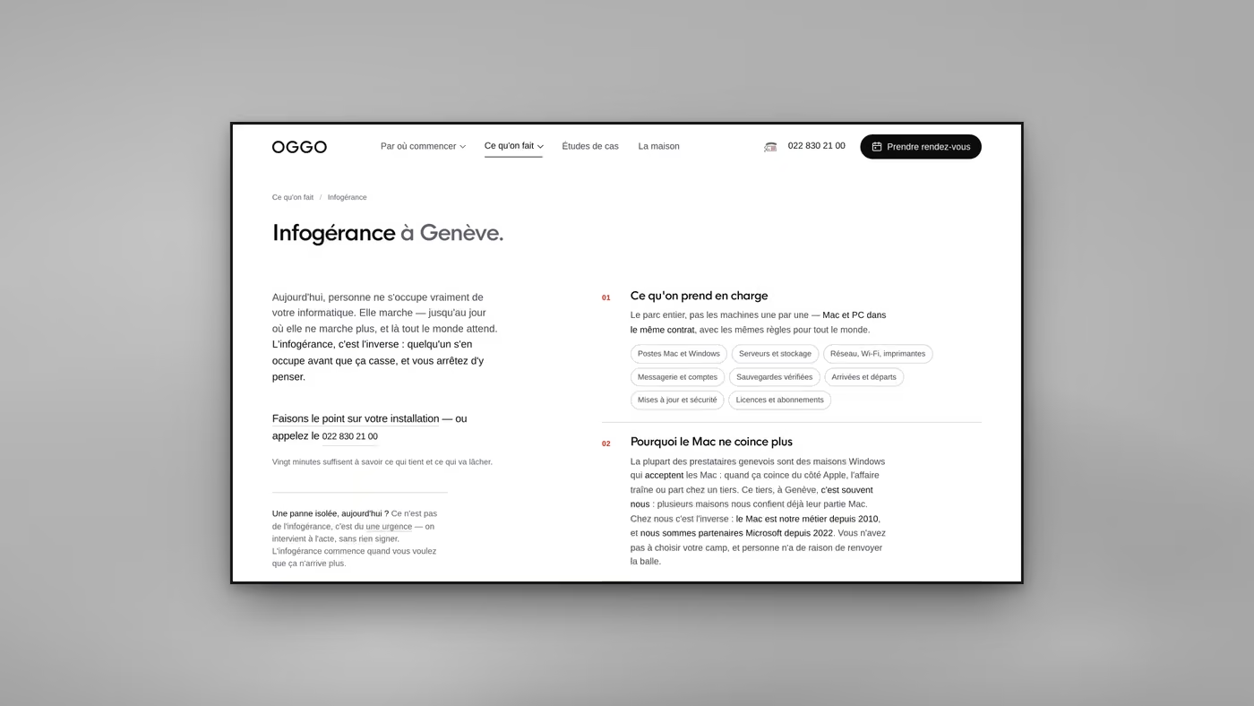
VisualThe managed-services page. On the left, the pain in three sentences; on the right, eight labels for what is covered, and underneath, the one line that actually sets the firm apart: the Mac is its trade, and the Microsoft partnership exists too. The client does not have to pick a side.
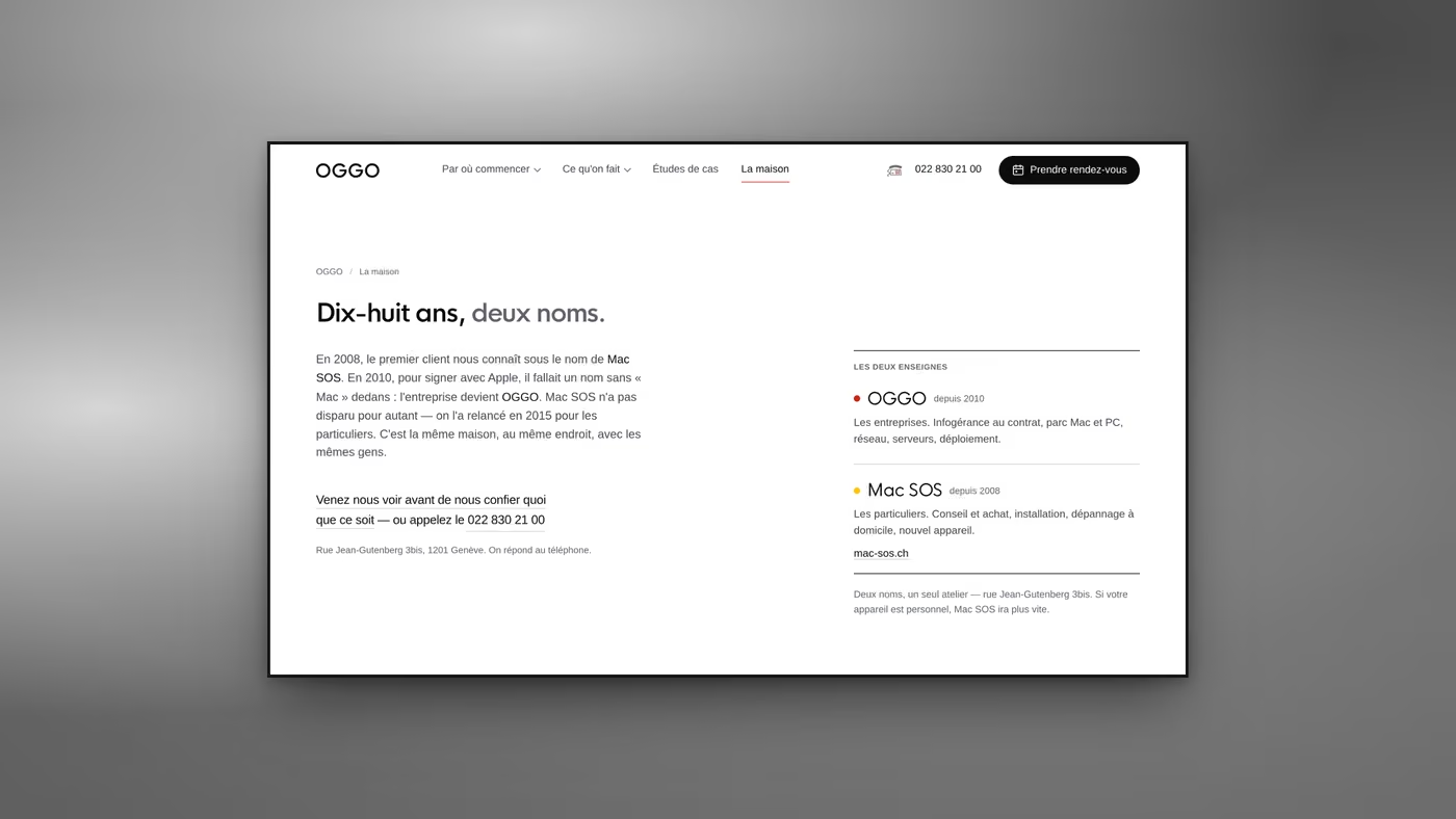
VisualThe page that tells the firm's story. Two names, one workshop, one address: the company is told as a continuity, not as an org chart. A single coloured dot is enough to separate the two brands: red for businesses, yellow for private clients.
Built · 03

Interface — mobile

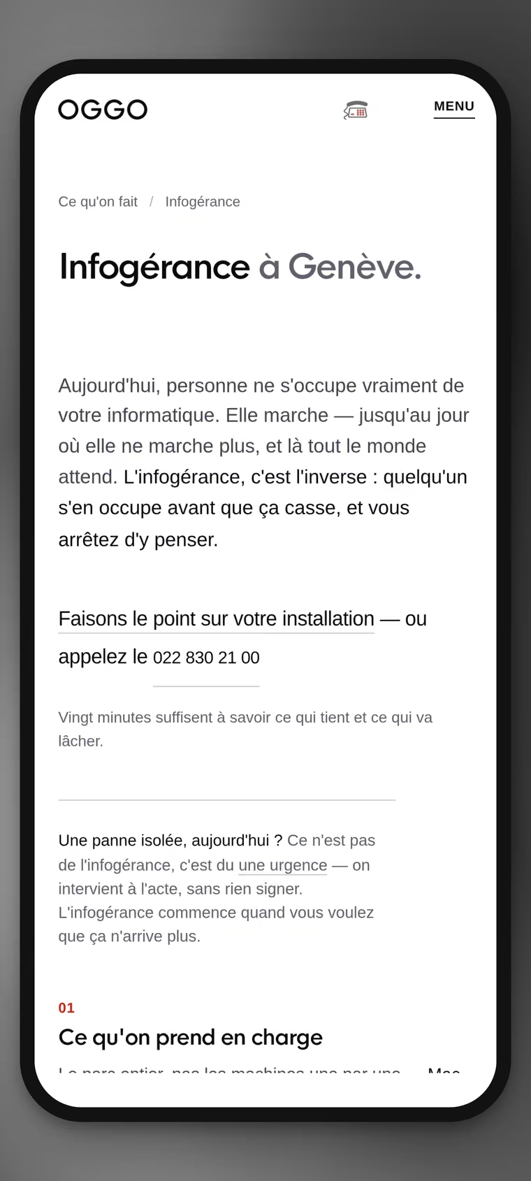
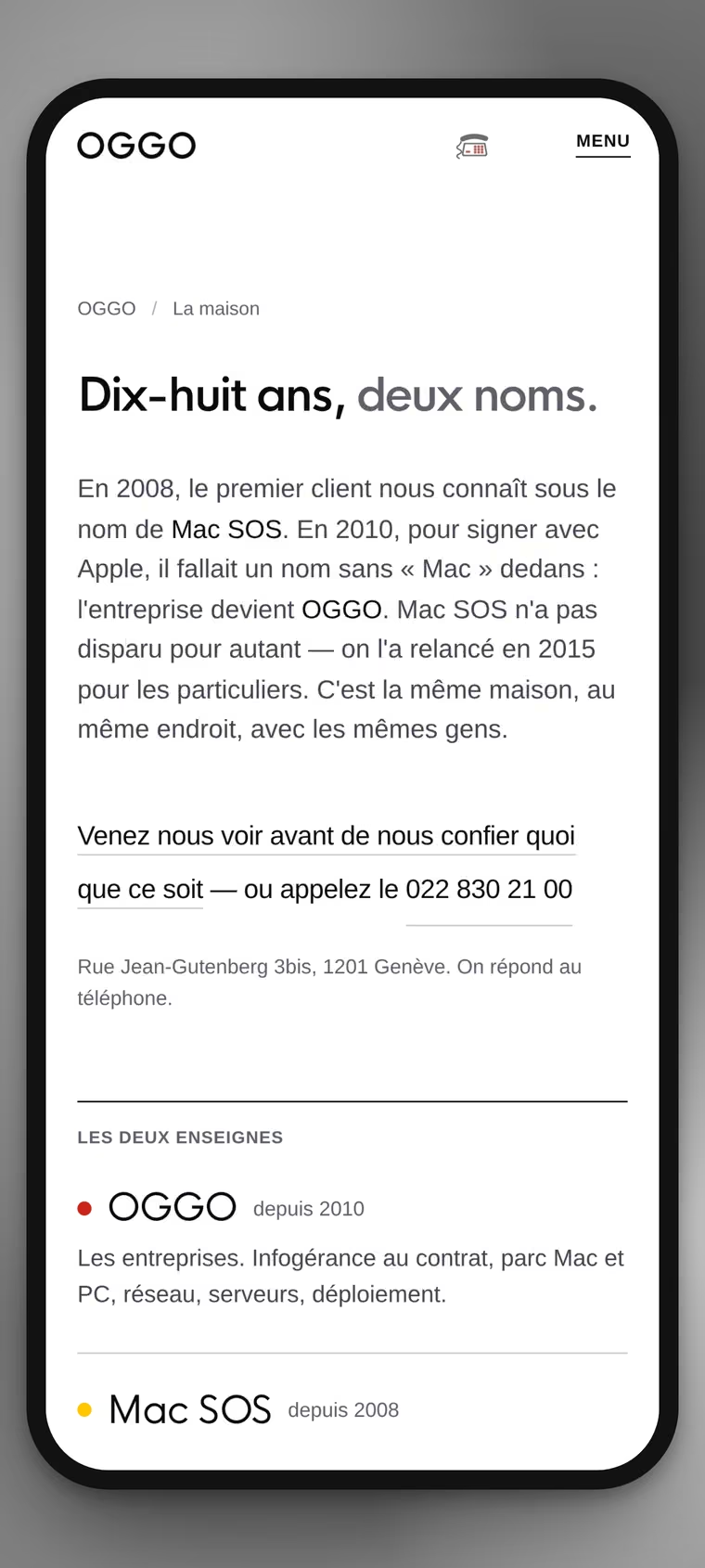
The same pages, redrawn rather than shrunk. This is where half the visits land.
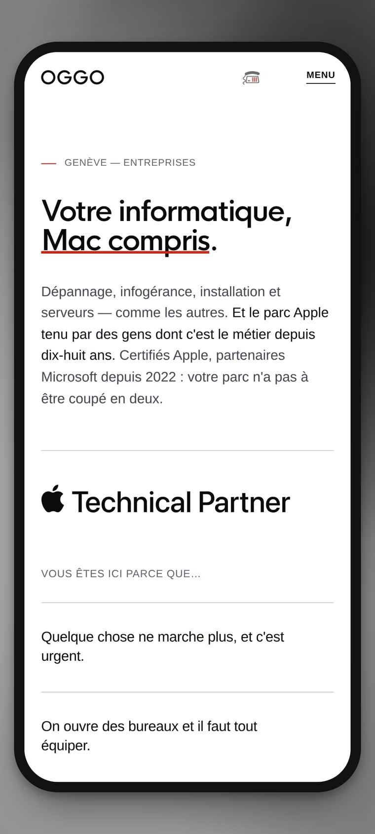
VisualThe home page on a phone. The heading keeps its two weights and its red underline; the column of six sentences no longer sits alongside, it drops below the promise. Nothing was removed: the reading order changed.
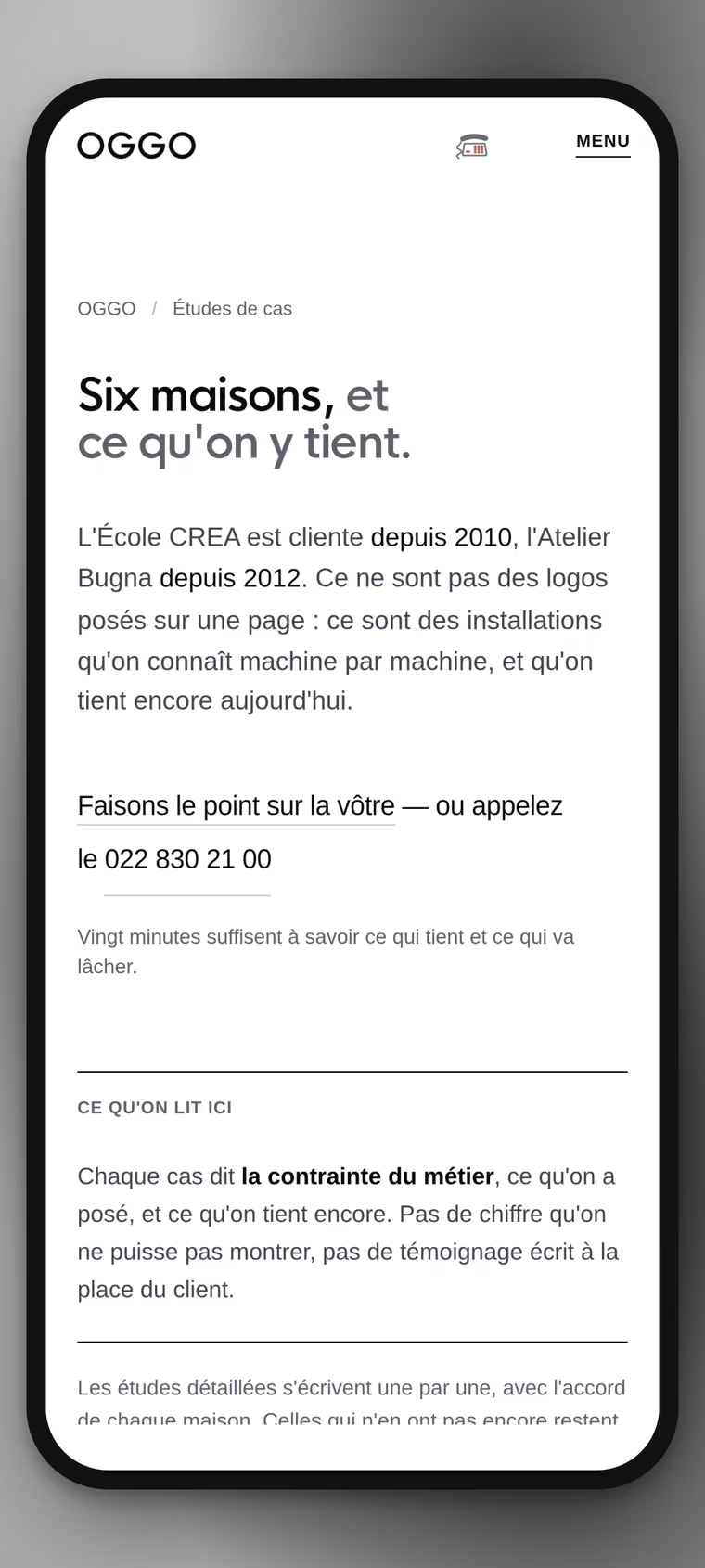
VisualThe case studies on a phone. The intro, the call line and the panel stack in the order they are read, and the number stays within thumb reach: on this site it is never more than a screen away.
VisualManaged services on a phone. The two columns become a single run, and the red numbers, 01, 02, carry the thread: on a narrow screen, numbering does the work the column layout used to do.
Visual“La maison” on a phone. The two names stack, each with its dot, and the address stays right under the call line. The same page, in the same order: there is no lightened phone version.
Built · 04

Development

What you cannot see at a glance, and what makes a site hold: the vector logotype, measured contrast, the footer grid, the sitemap.
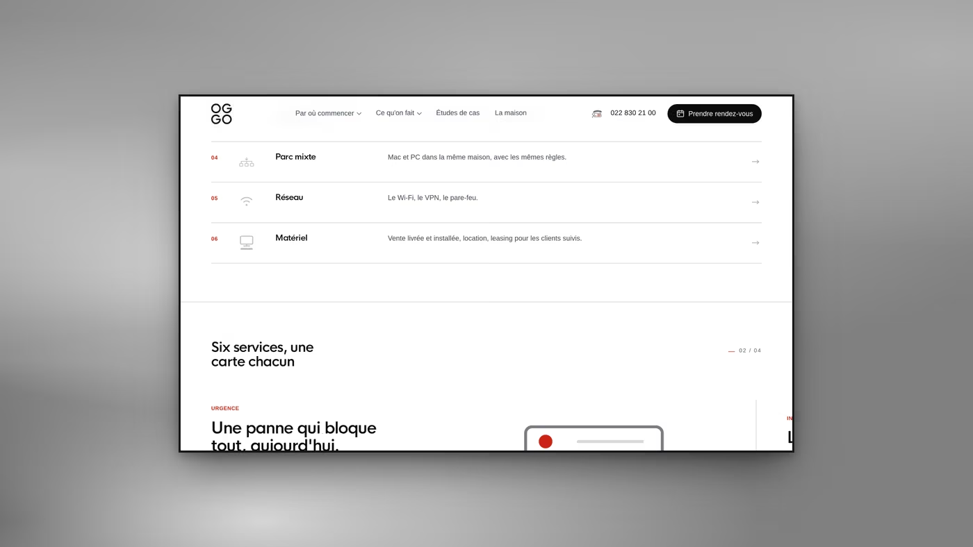
VisualSix services, one card each. Every row carries its number, its icon, its one-line sentence and its arrow: a contents page you can skim, opening on “urgence” rather than on a catalogue.
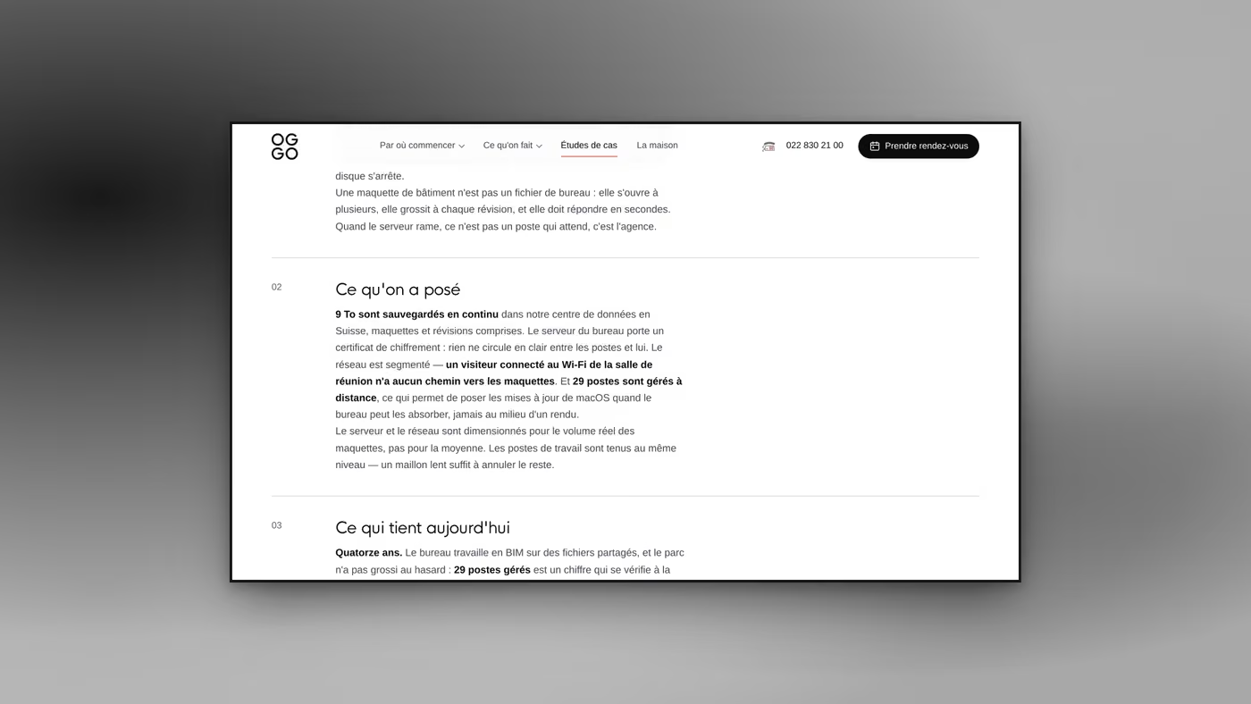
VisualA case study, mid-read. The figures are bold inside the sentences, not boxed off: nine terabytes backed up continuously, twenty-nine machines managed remotely. And the next section puts them back into time, which is the only proof that counts.
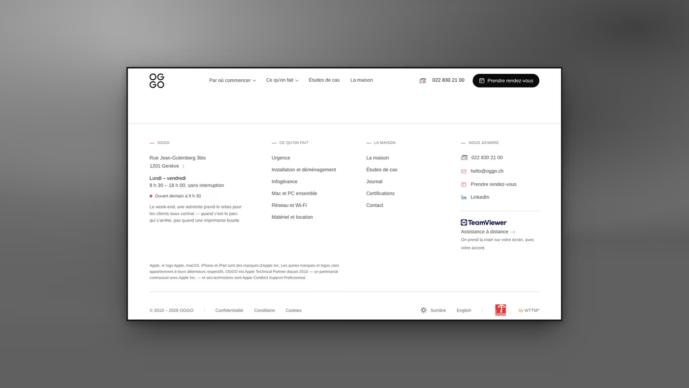
VisualThe footer. Four columns, the address, the opening hours, and one line you will find almost nowhere else: “Ouvert demain à 8 h 30” (open tomorrow at 8.30). It answers the question you ask at 7 pm, written where you look for it.
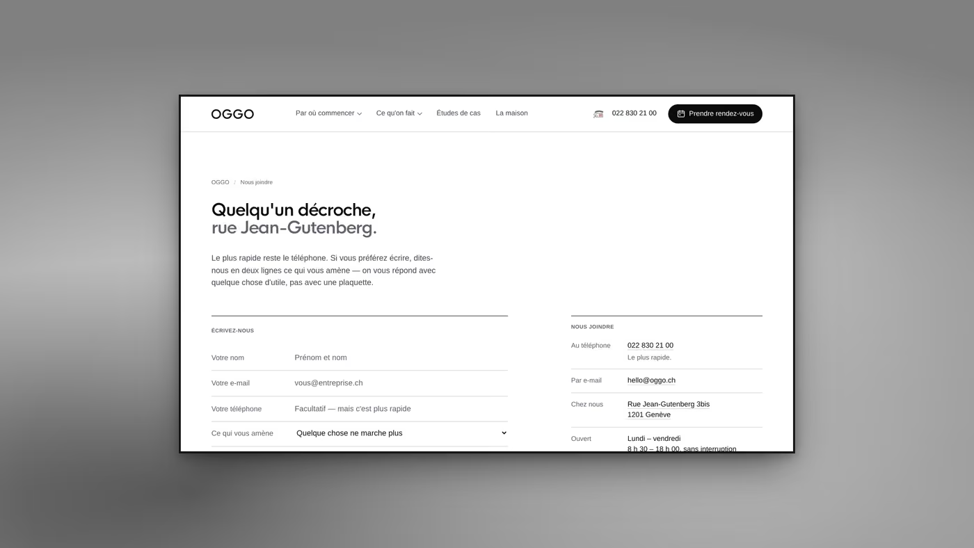
VisualThe contact page. The heading names the street, the form asks for four things, one of them optional, and the right-hand column puts the phone first. “Le plus rapide reste le téléphone” (the phone is still the fastest way) is written plainly: a form that does not claim to be the best route.
Welcome to the Machine
Client access · one address, one password per space
Your client space↗espace.wttm.ch
WTTM Rue Jean-Gutenberg, 3bis, 1201 Genève InstagramBehanceAwwwards Legal · Privacy · © 2026
Search this siteSearch/