Search this site/
Projects — 03 / 05

SYCOM

You entrust your telephony and your network to whoever inspires trust. The site has to say what SYCOM can do first, and in order.RecognitionAwwwardsNominee2023

Period2022PlaceSwitzerland
RoleDesigned, builtLivesycom.ch
CraftsIdentity · Print · Interface · Development
DeliveredBrand, site, stationery, vehicle livery

SYCOM installs and maintains the telephony, networks and IT of businesses across French-speaking Switzerland: on-site or cloud PBX, mobiles, cabling, support. Five services, four of which a client cannot name: the site is built on those five entries, and nothing comes before them. Black holds everything; blue is only used to point.

The project, in pictures ↓
Built · 01

The opening

The name, the five entries, and nothing to scroll past before seeing them.
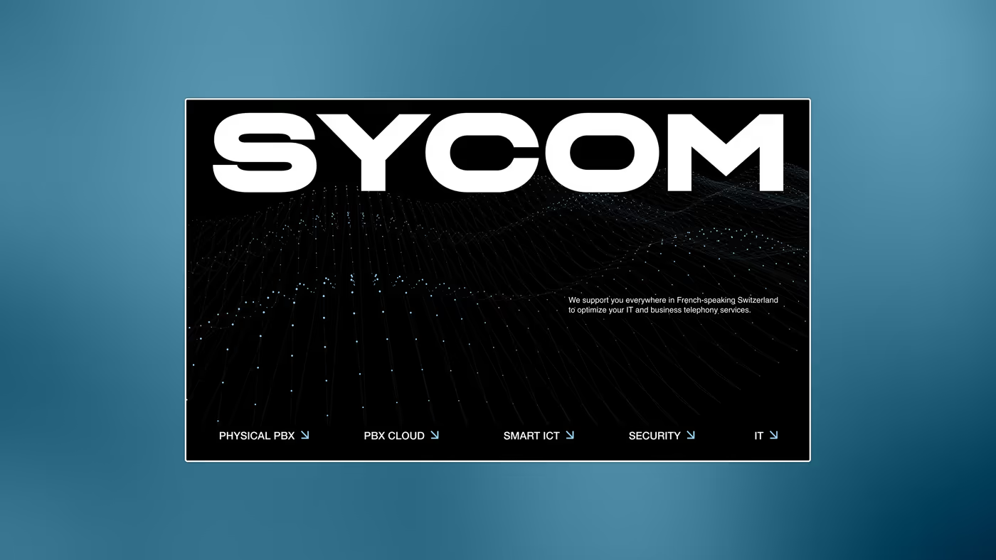
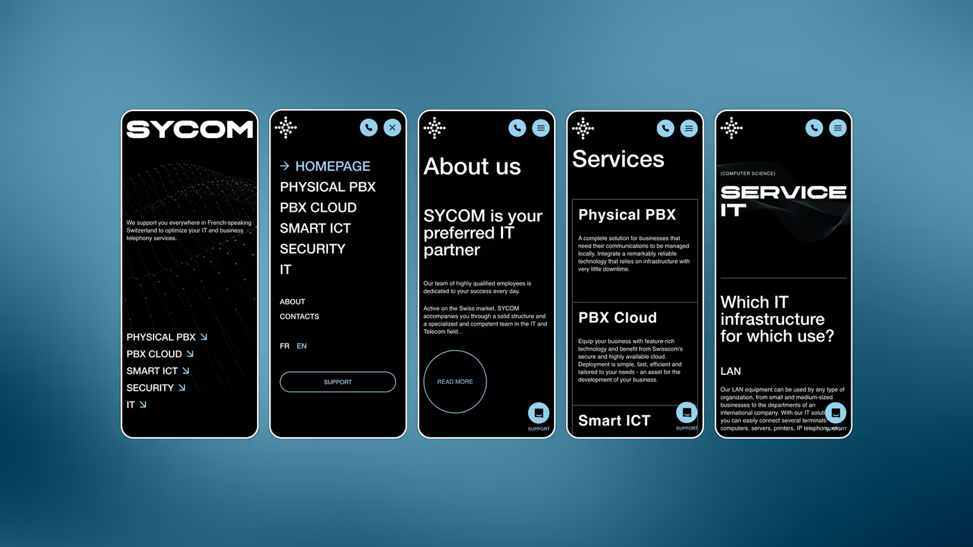
VisualThe home screen. The name in wide capitals over a field of raised dots, and the five services along the bottom: physical PBX, cloud PBX, ICT, security, IT.
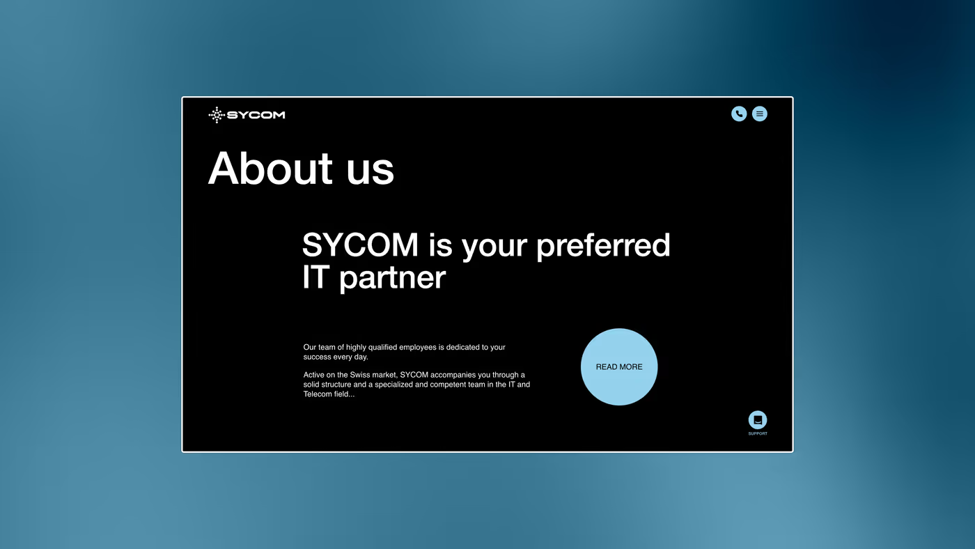
Visual“About us”: one sentence, one paragraph, one round button. The blue disc is the only coloured element on the screen.
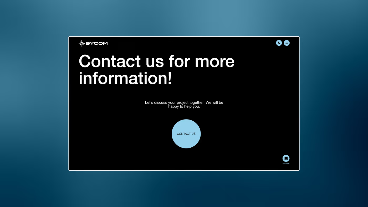
VisualThe contact screen. Black is held top to bottom; the only hook is the punctuation in the heading.
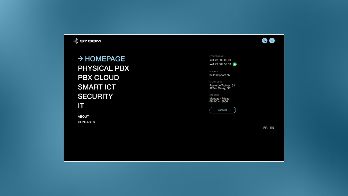
VisualThe menu open: the five services first, “about” and “contacts” after, smaller. The details sit in the right column.
Built · 02

The services

Each service has its page, and each page opens on the question actually asked: what is it, and who is it for.
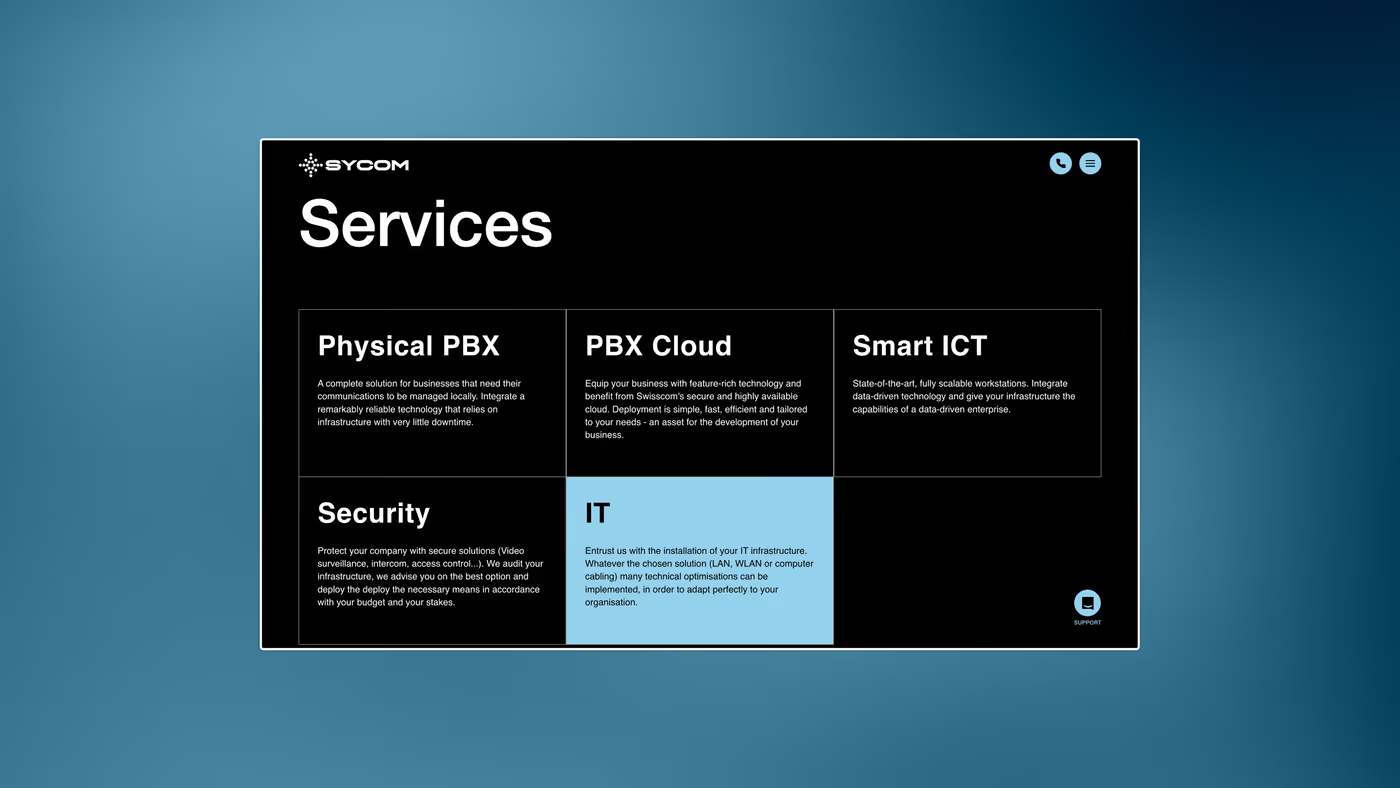
VisualThe service grid, six tiles. The hovered one turns blue: it is the only hover state on the whole site.
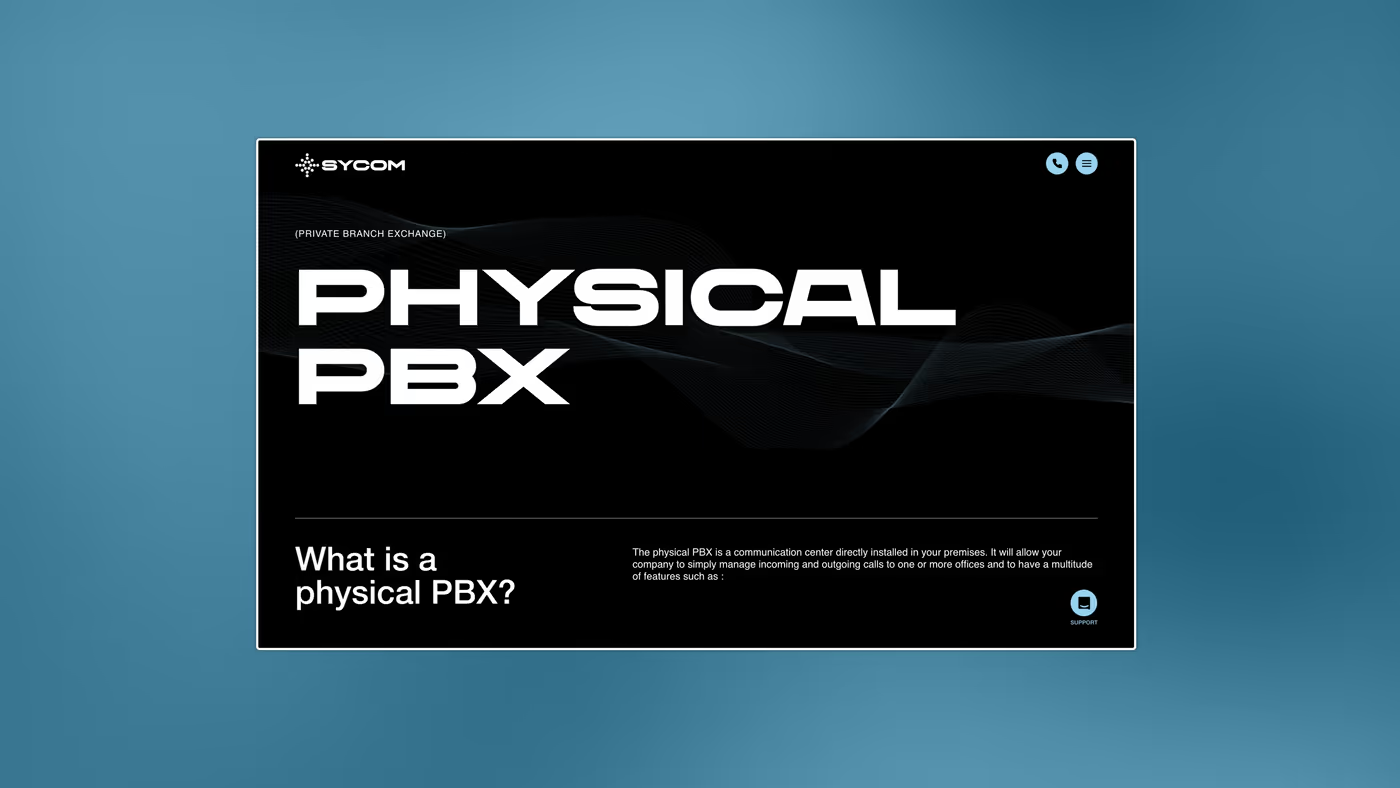
Visual“Physical PBX”. The heading is set over two lines, very large; below it the question and its answer, in two columns of fine text.
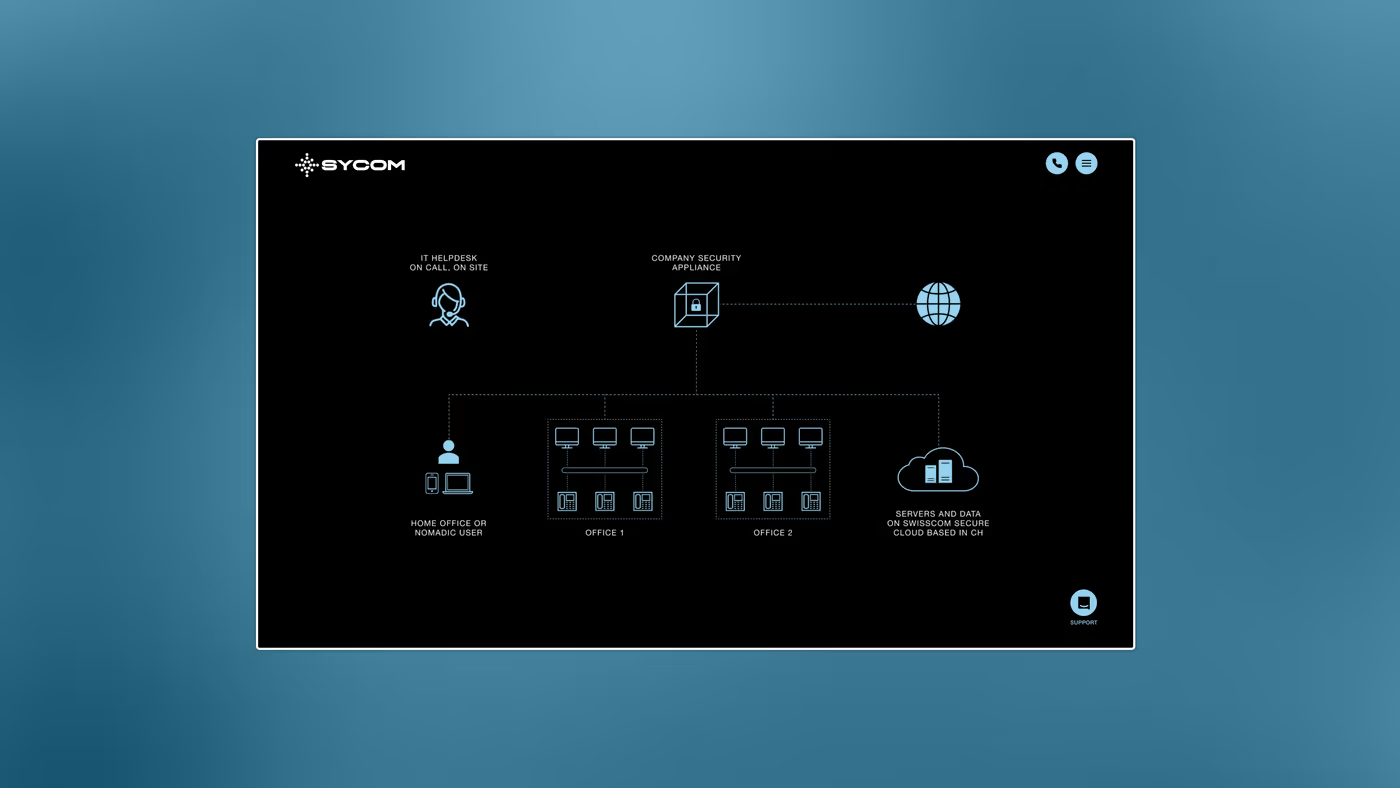
VisualThe architecture diagram: handsets, switch, gateway, network. Drawn in line, with no software screenshot.
VisualFive phone screens. The menu becomes a full-height list; the five services stay the first five lines.
Designed · 03

Off the screen

The mark was drawn to stay legible on a van door, at three metres. The rest follows from that.
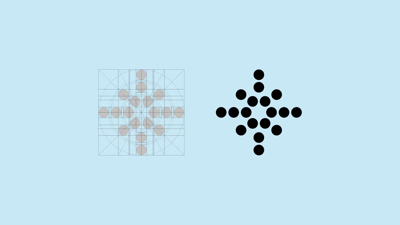
VisualHow the mark is built: the grid left, the drawing right. Nine dots per arm, no strokes: that is what keeps it sharp at small size.
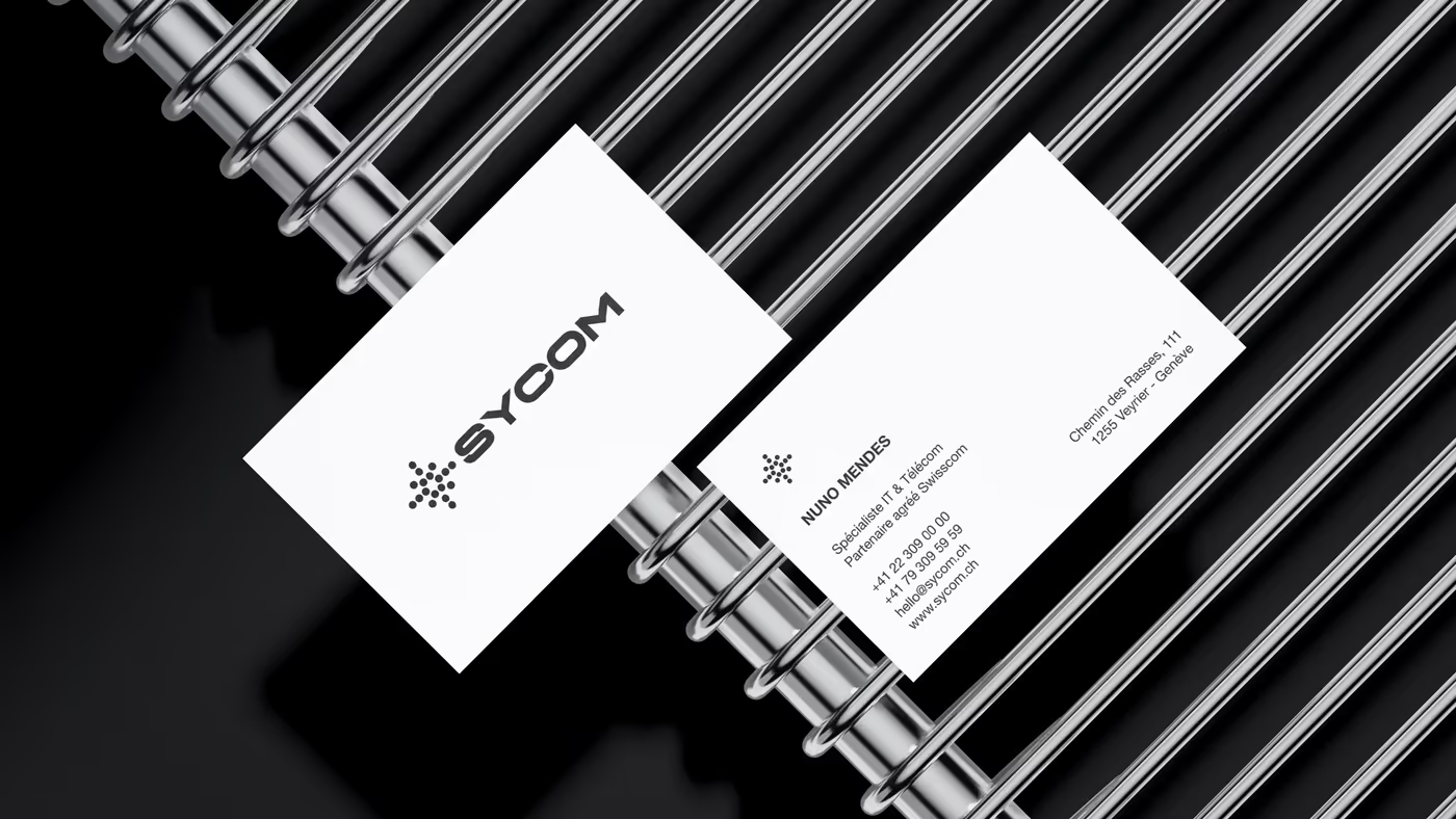
VisualThe cards, white, on a ribbed ground. The mark stands alone: the name goes on the back.
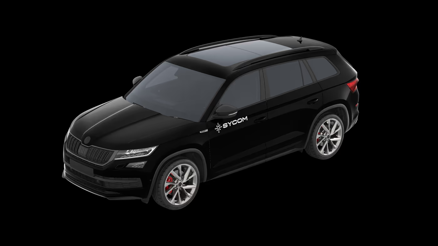
VisualThe vehicle livery. Name and mark in white on black bodywork, on the door and the tailgate: no address, no phone number, no list of services.
The rule

What holds the brand

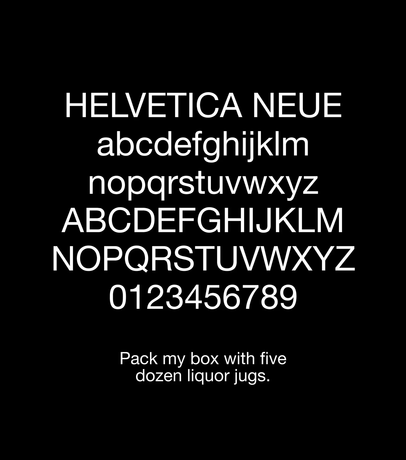
Two typefaces and four colours: one face for titles, one for reading, and the second carries almost the whole site.
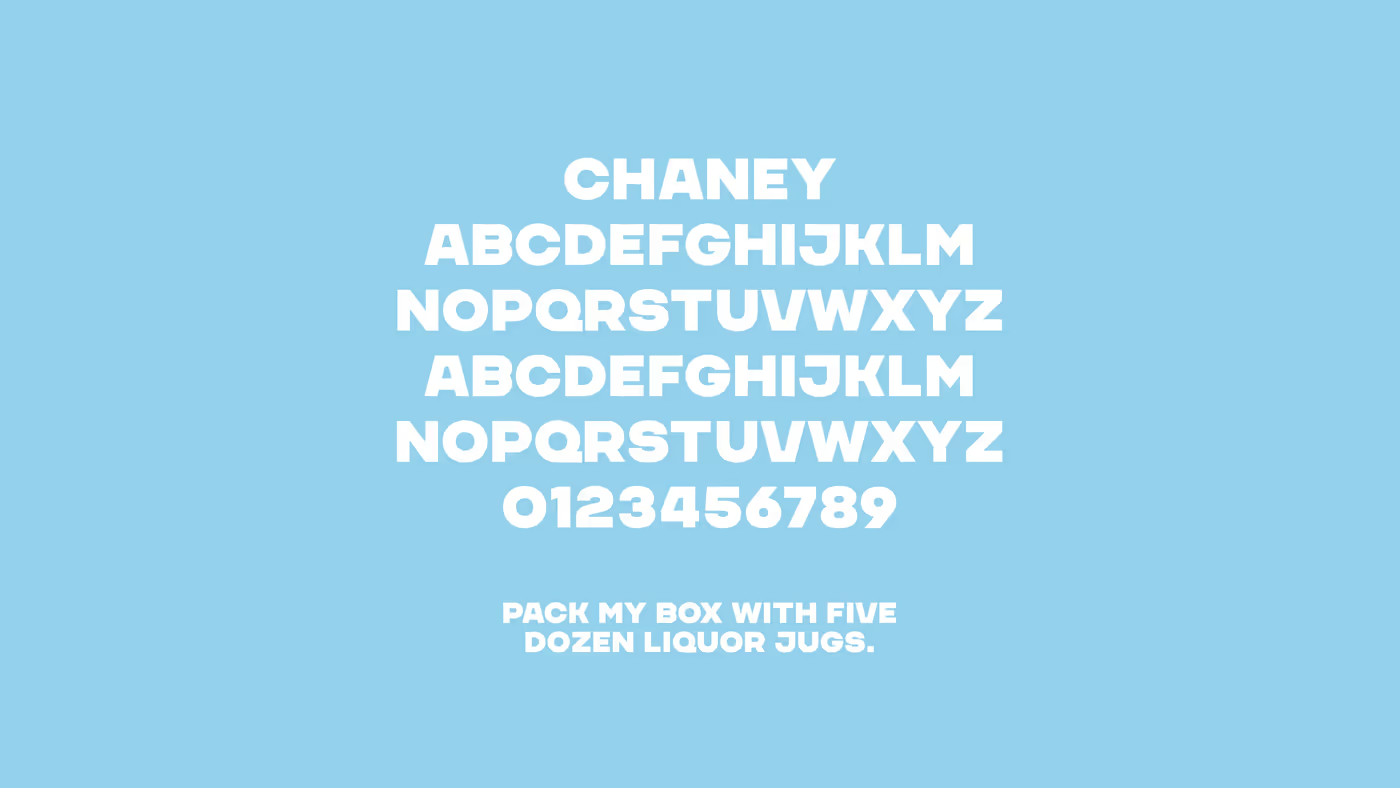
VisualChaney, for headings. A very tight grotesque, capitals only: it carries the name and the service titles, never a sentence.
VisualHelvetica Neue, for everything else. On black it is set at regular weight with wide leading: that is what makes technical text readable on a dark face.
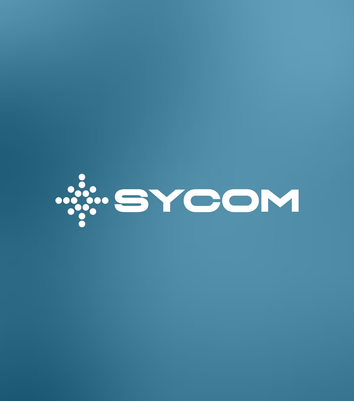
VisualThe full logotype, mark and word, on the brand blue. It is the only lockup where the two share a height.
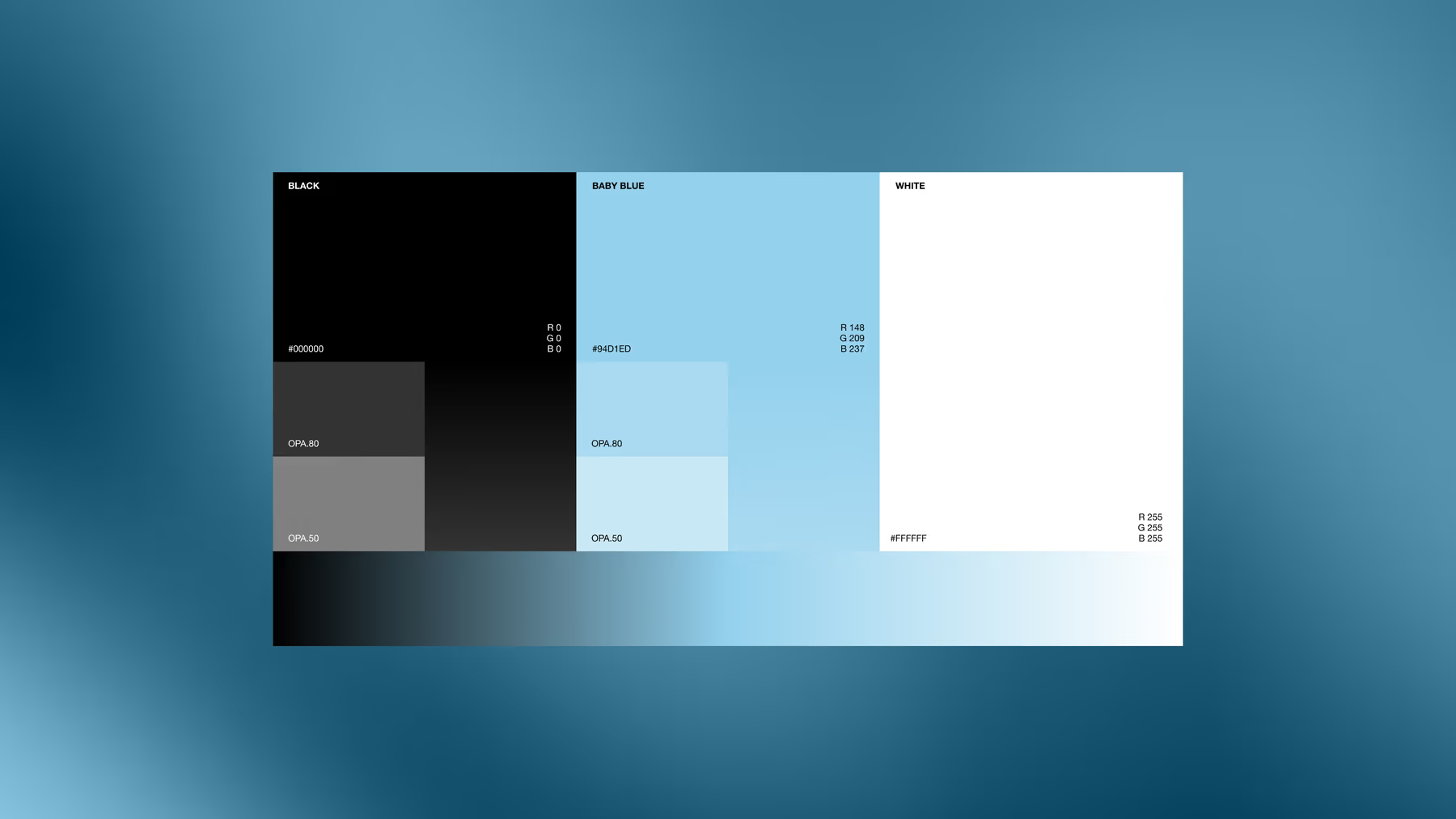
BoardThe colour board. Black holds it all together; blue is there only to point.
the black
the blue
the pale blue
the white
Chaneyheadings · capitals
Helvetica Neuerunning text
Welcome to the Machine
Client access · one address, one password per space
Your client space↗espace.wttm.ch
WTTM Rue Jean-Gutenberg, 3bis, 1201 Genève InstagramBehanceAwwwards Legal · Privacy · © 2026
Search this siteSearch/