Search this site/
Projects — 02 / 05

Verticité

The website of a Geneva architecture practice: its projects put in order and left to speak: black-and-white photographs, colour renderings.RecognitionAwwwardsNominee2023

Period2023PlaceGeneva
RoleBuiltLiveverticite.ch
CraftsInterface · Development
DeliveredSite, art direction of the site

Verticité Architecture — VJA — came out of Knight Frank Switzerland in 2020. The practice works in architecture and interior design from Geneva. The site had to show the projects without commenting on them: photographs in black and white, renders in colour, and text cut back to what can be checked.

The project, in pictures ↓
Built · 01

The opening

The name holds the screen alone, then leaves to the left as you scroll. What replaces it is a building site, not a mood photograph.
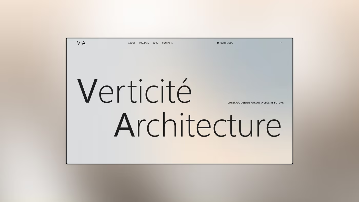
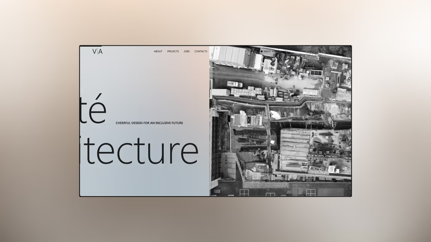
VisualThe home screen, light face. The logotype sits on two lines, V and A capitalised, the rest lower case: one letterform serves as both mark and heading.
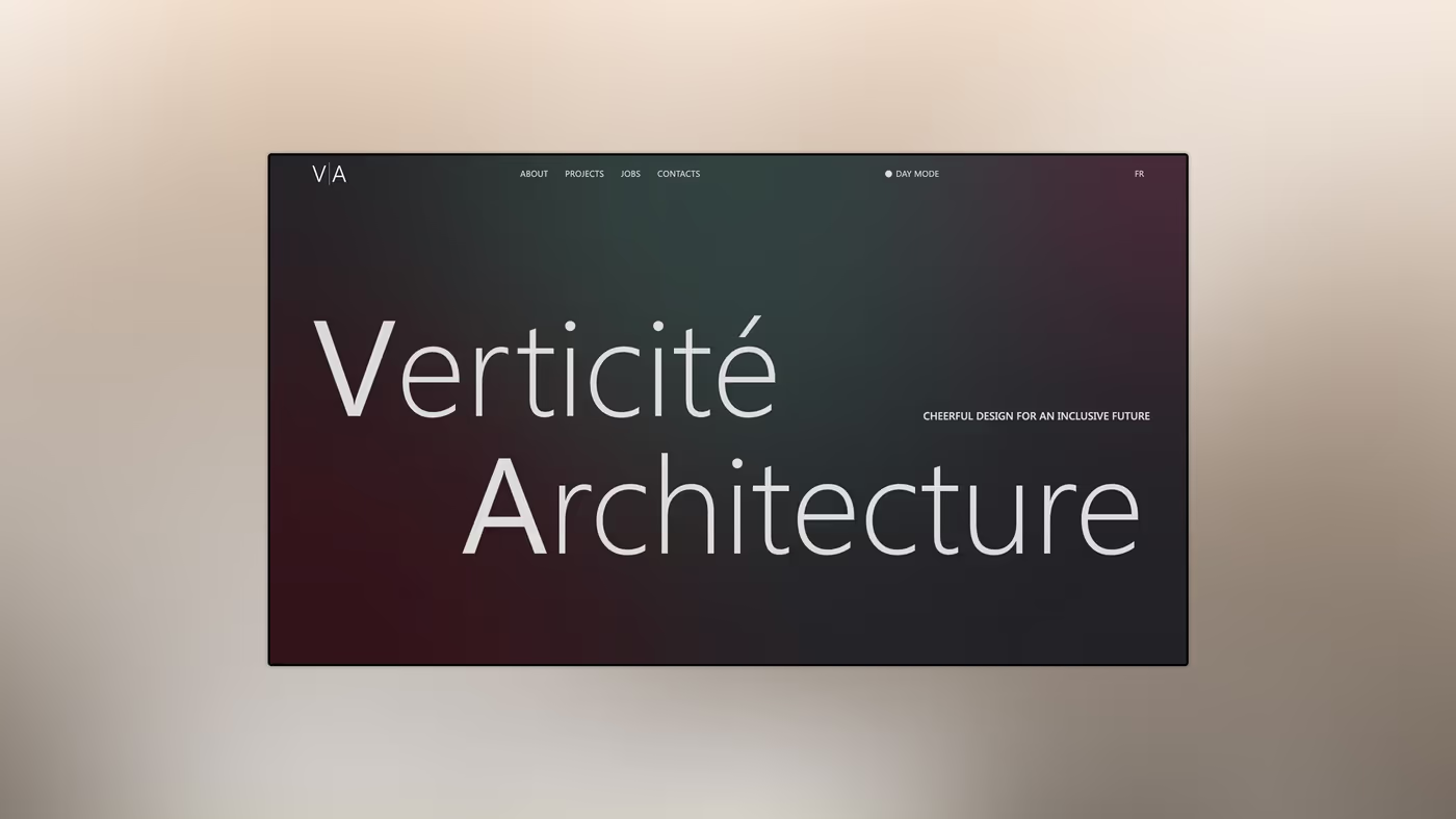
VisualThe same screen, dark face. The ground turns deep burgundy; nothing else moves, neither the grid nor the weight.
VisualOn scroll, the heading leaves to the left and a site photograph takes its place. Black and white is held across every photograph on the site.
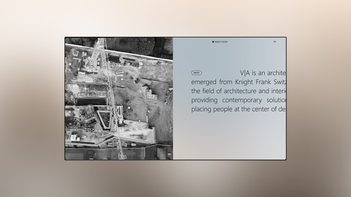
VisualAerial view and first block of text. The practice says where it comes from before saying what it does.
Built · 02

The practice

Where the practice comes from, and who answers for what. The team is shown in portraits, not in an org chart.
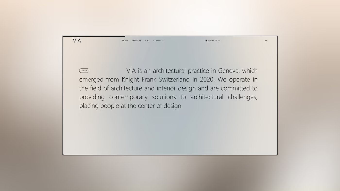
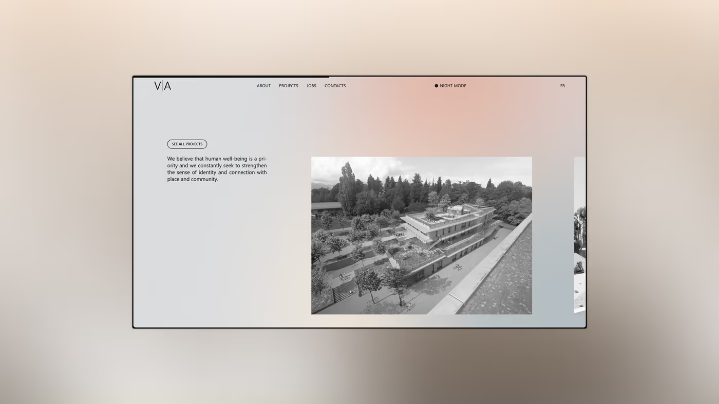
VisualThe practice text, alone on cream: out of Knight Frank Switzerland in 2020, architecture and interior design, people at the centre of the brief. Nothing more.
VisualA completed building, framed wide, in black and white. The photograph carries no caption here: it waits for the project page.
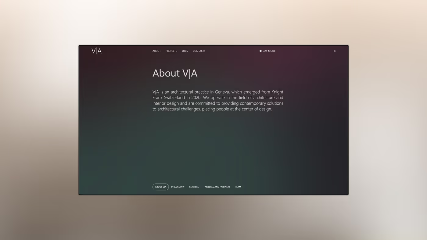
Visual“About VJA” on the dark face. Burgundy and slate share the ground; the text keeps the same size as on the light face.
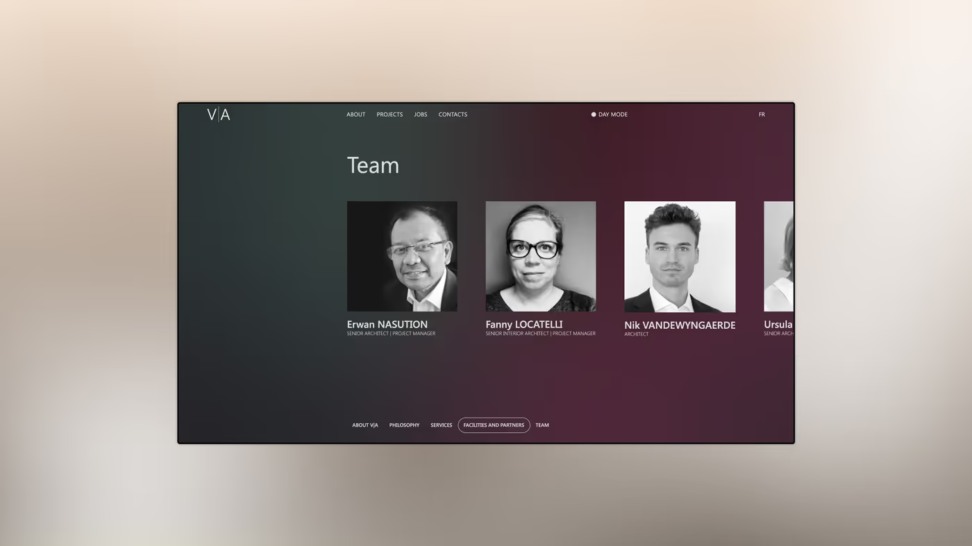
VisualThe team. Black and white portraits, on one baseline, cropped to one scale: that is what puts them on equal footing.
Built · 03

The work

This is where colour comes back: renderings in colour, photographs in black and white.
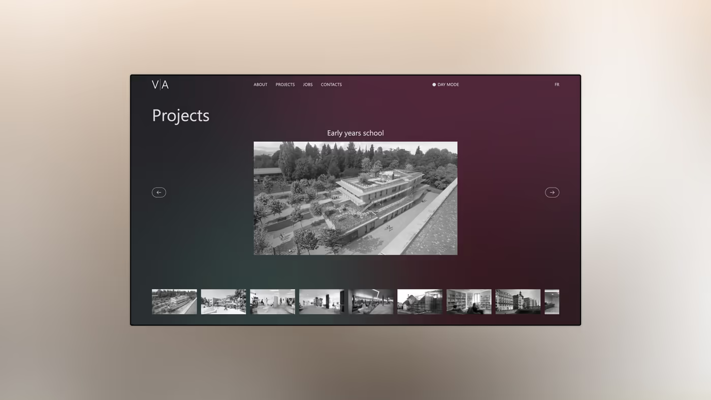
VisualThe work index, dark face. The strip of thumbnails at the bottom gives the depth of the portfolio without leaving the screen.
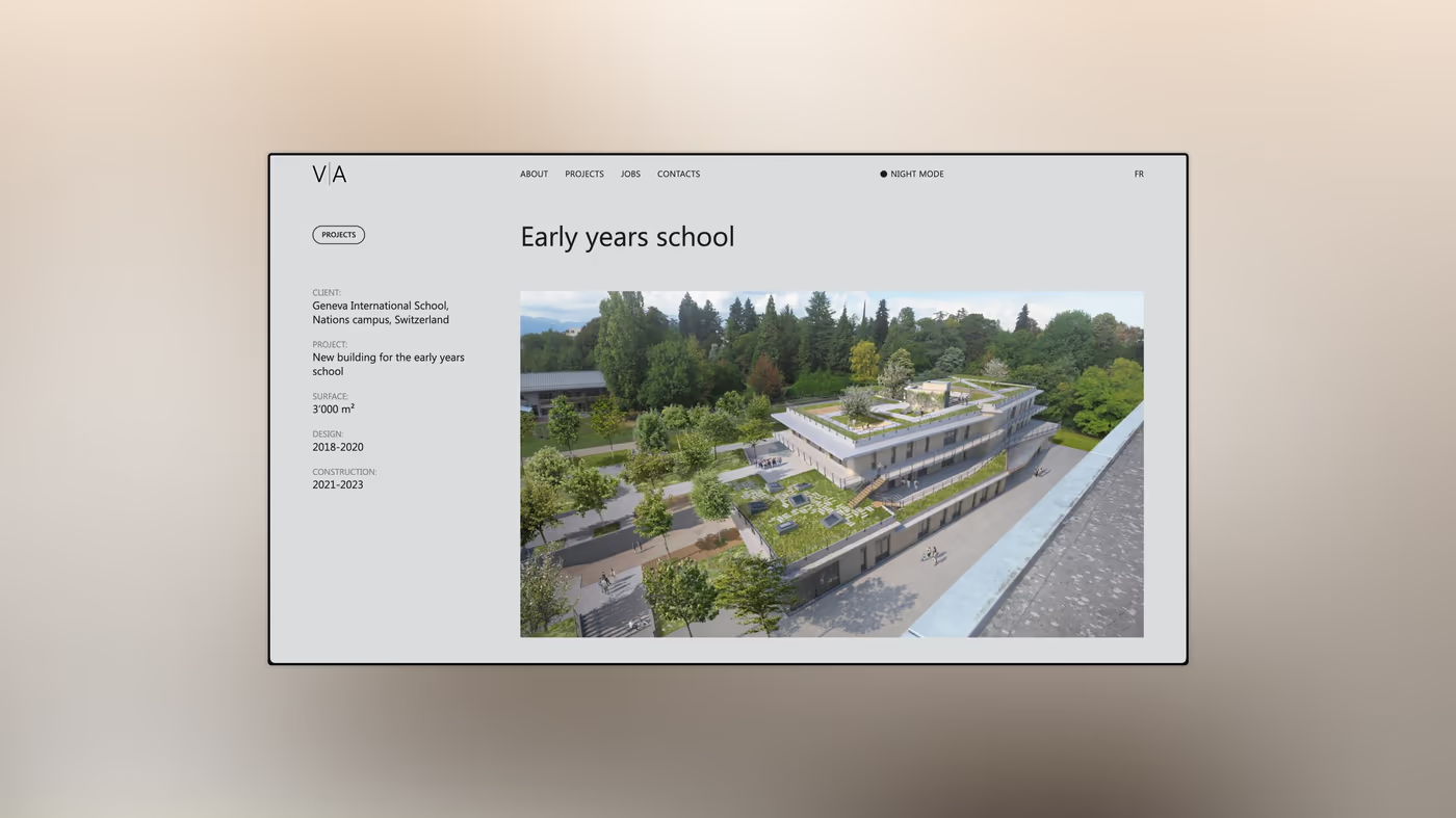
Visual“Early years school”. The page opens on the render; the project data: client, place, area, year, sits in a narrow left column.
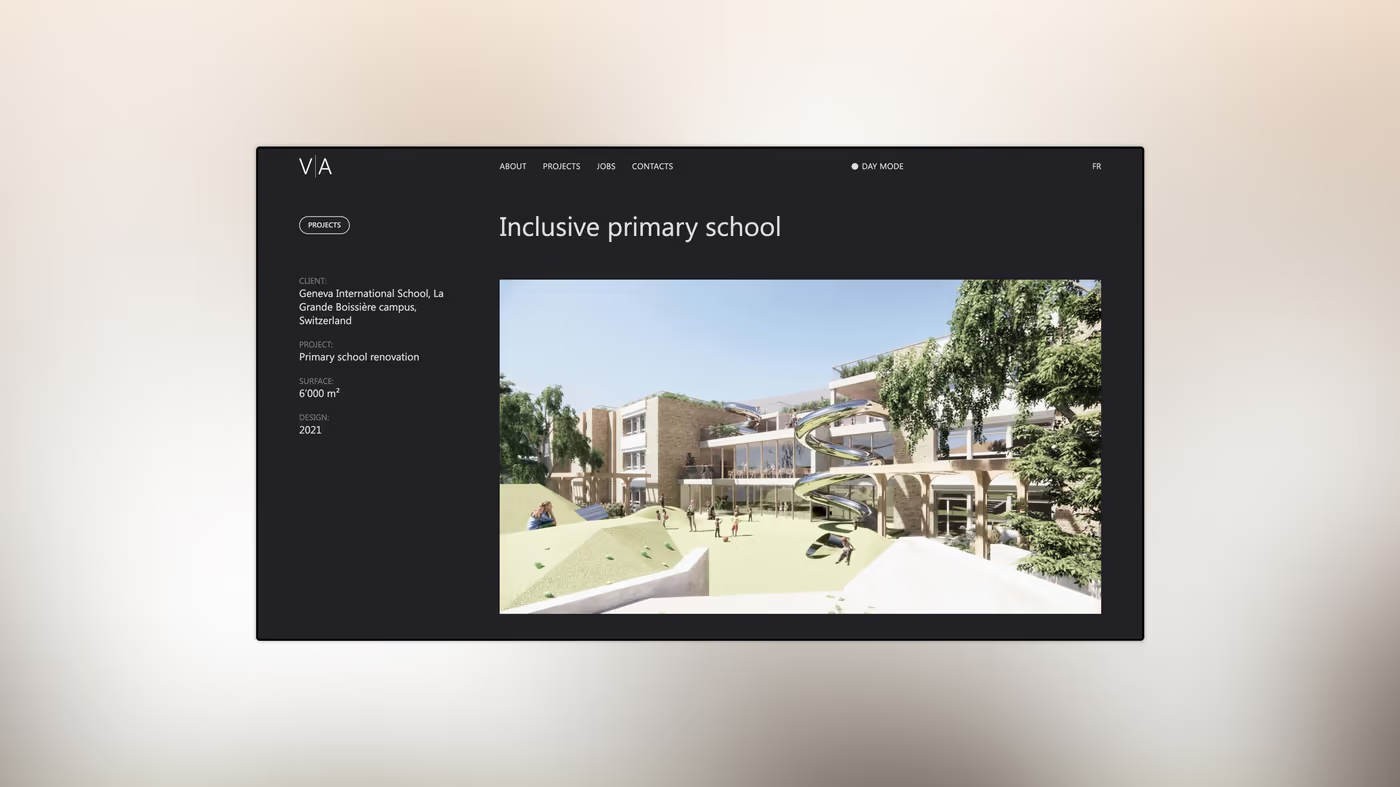
Visual“Inclusive primary school” on the dark face. The render takes the useful width; the ground does not frame it, it steps back.
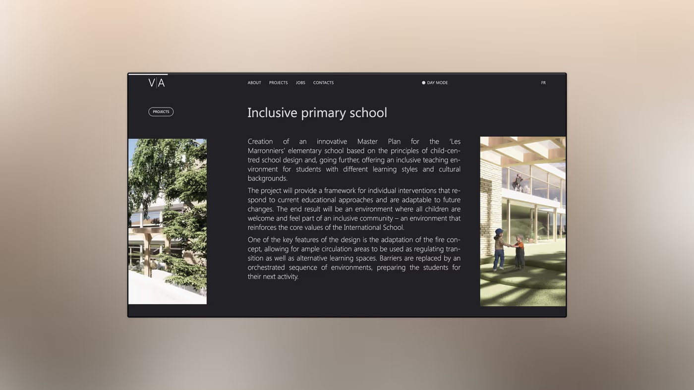
VisualThe same page, further down: long text left, render right. The text explains the brief: a master plan adapted to each pupil’s needs.
Built · 04

What holds the brand

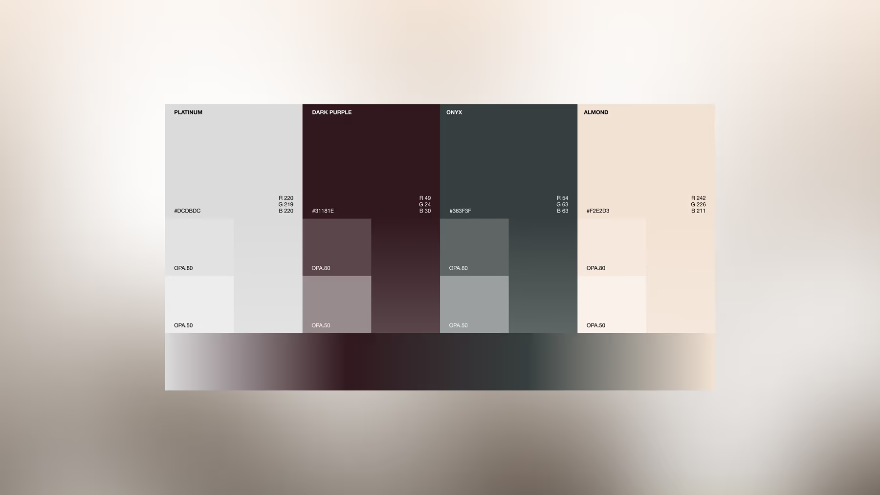
A single typeface, four colours, and pages designed for the phone first.
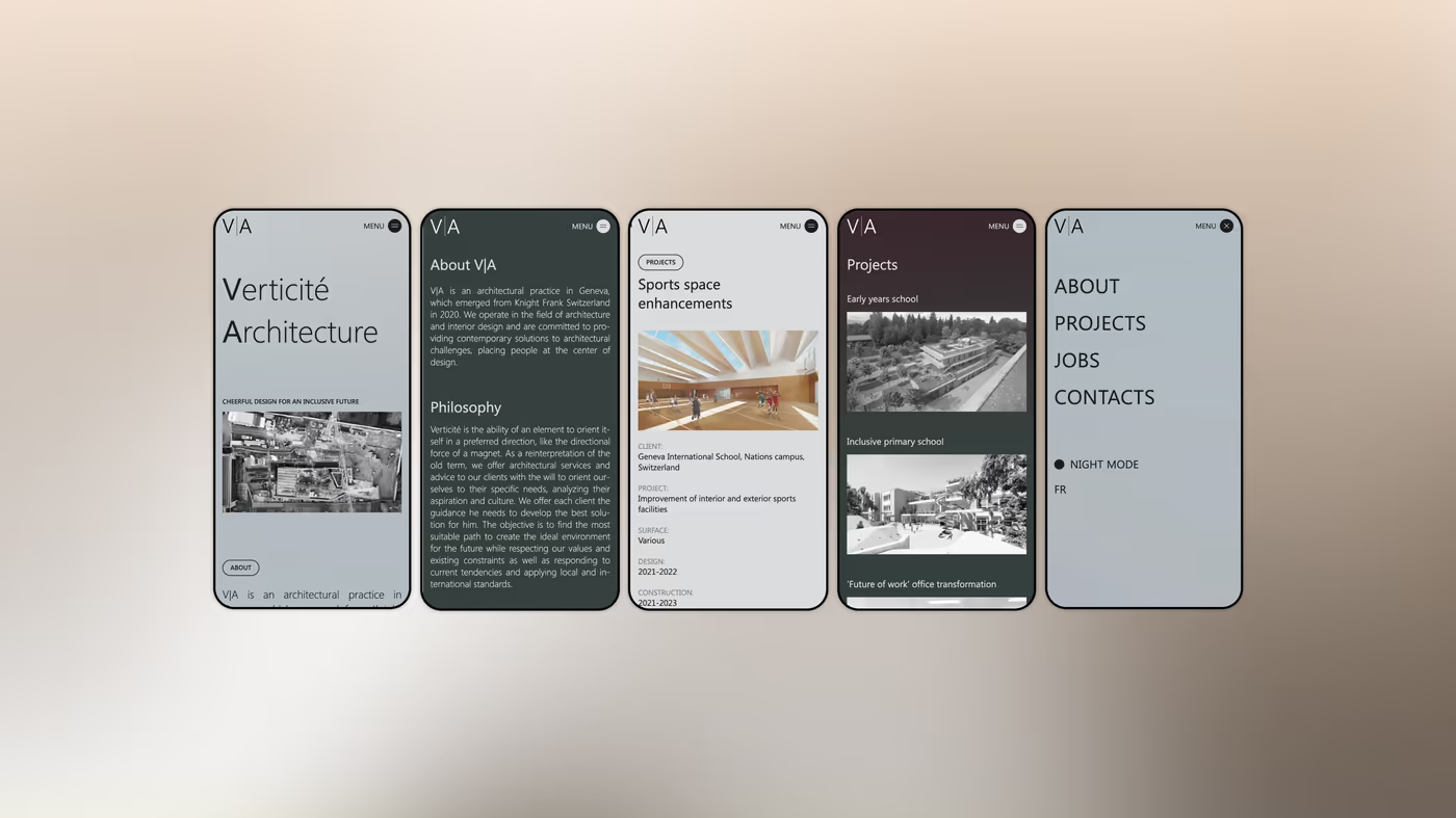
VisualFive phone screens, in the order of the journey. The text column goes full width and the thumbnail strip becomes a horizontal scroll.
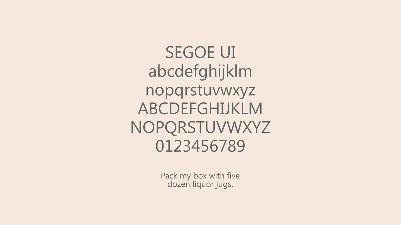
VisualThe type board. One family holds the whole site: Segoe UI, sans-serif, in two weights only.
BoardThe colour board. Burgundy for the dark face, cream for the light one; slate and grey do the rest.
the burgundy
the slate
the cream
the grey
Segoe UIthe whole site · two weights
Welcome to the Machine
Client access · one address, one password per space
Your client space↗espace.wttm.ch
WTTM Rue Jean-Gutenberg, 3bis, 1201 Genève InstagramBehanceAwwwards Legal · Privacy · © 2026
Search this siteSearch/